Analytical Card
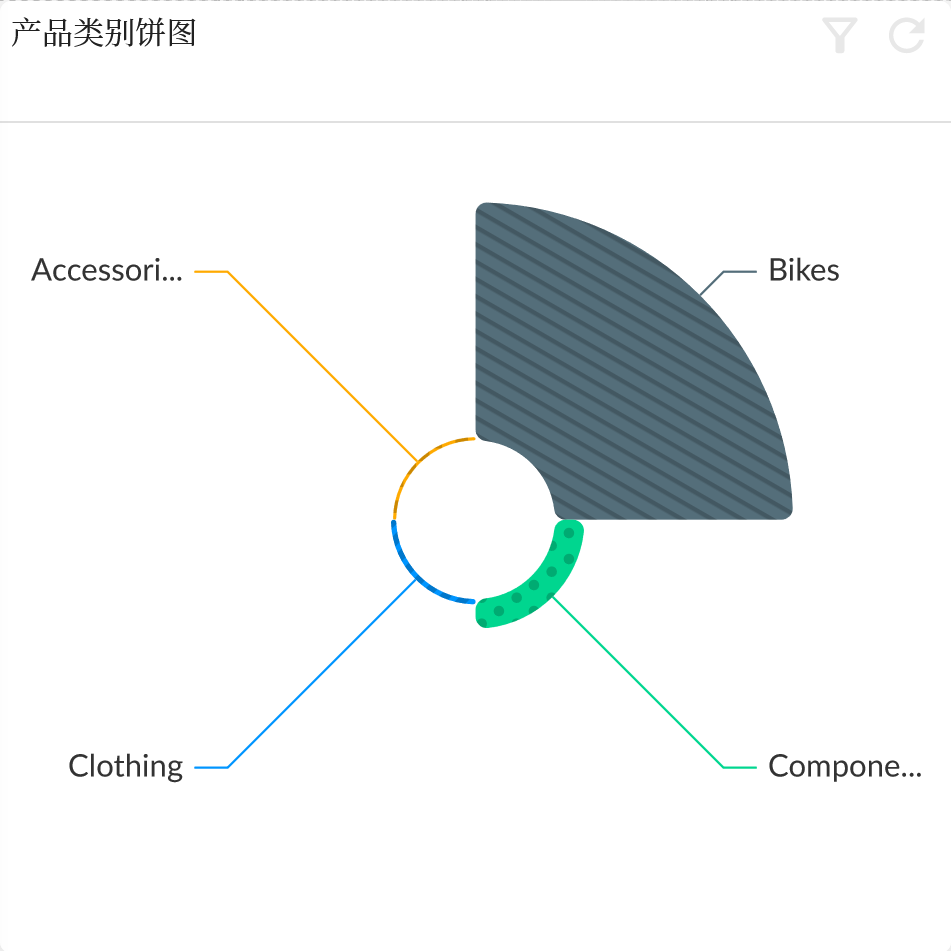
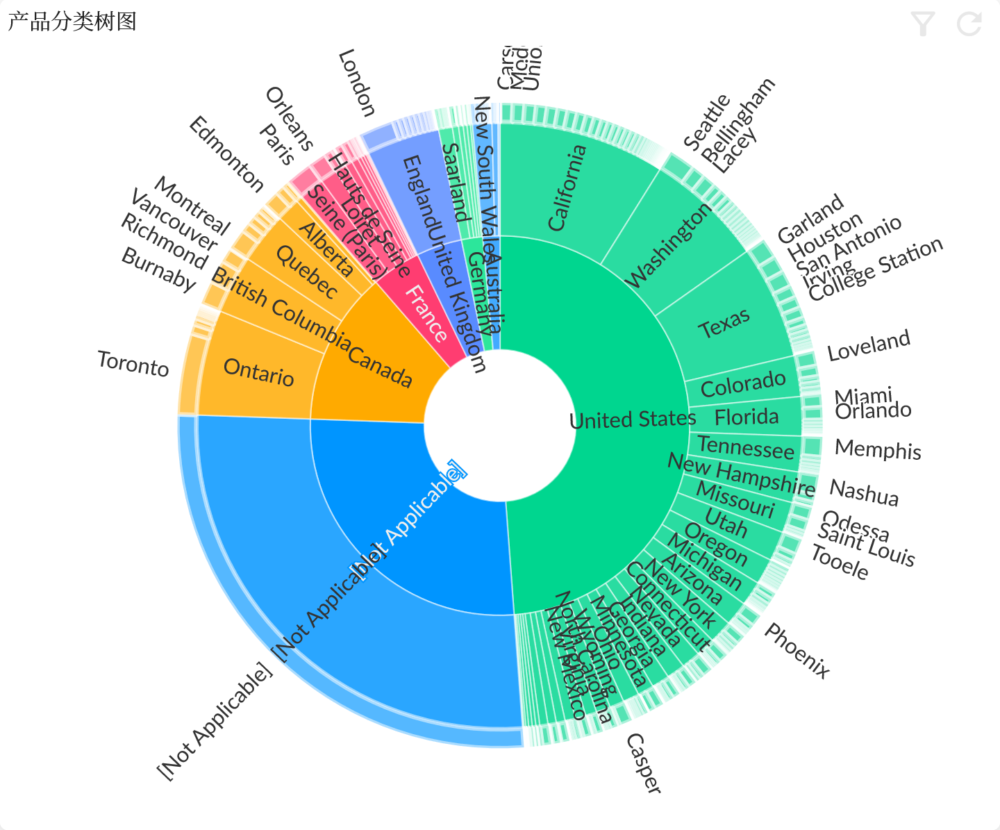
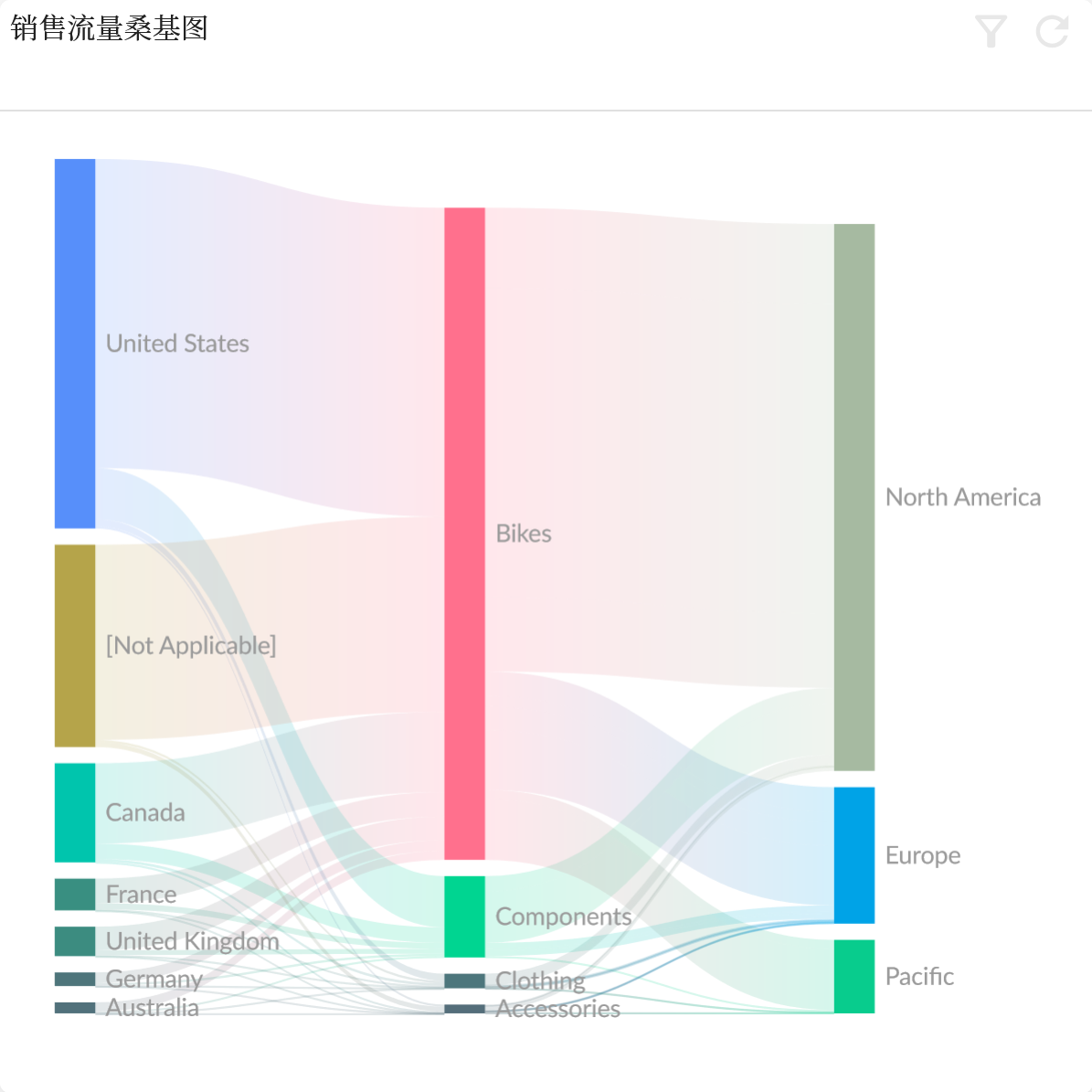
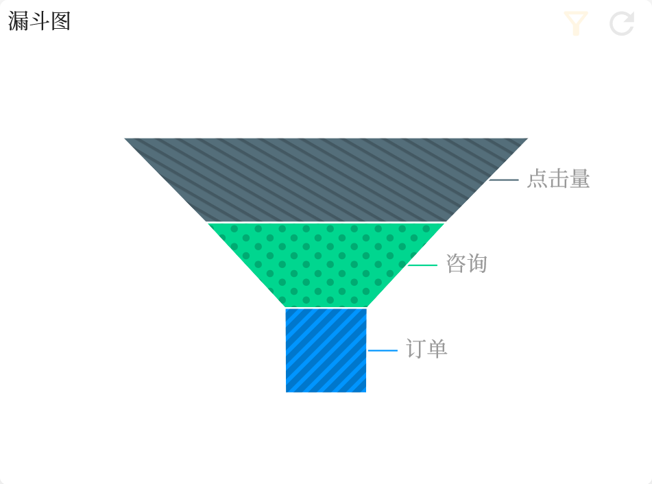
The Analytical Card is a type of widget that is used for displaying visualizations by drawing graphical elements. As a general-purpose graphical rendering container, it can support various JavaScript graphics drawing libraries such as ECharts and AntG2, with ECharts library being the predominant one currently.
Features List
- Title
- Data configuration, like other data-related components, explains how this component takes data and basic display configuration.
- Model: corresponding to the semantic model specified by the story dashboard
- Entity: A multidimensional model cube in the semantic model
- Chart Type: Chart type configuration, see below chart list for details
- Measure: one or more measure field configurations, including more detailed configurations
- Dimension: one or more dimension configurations, including more detailed configurations
- Selection Variant: filter the data to a certain extent
- Presentation Variant: including Top how many, sort conditions, drill-down linkage
- Analytical Card Options
- Hide Header
- Hide Data Download
- Hide Screenshot
- Real Time Linked Analysis
- Disable Context Menu
- Chart Settings
- Maximum Limit
- Digit Info
- Trellis Horizontal
- Universal Transition
- Chart Variants
Trellis
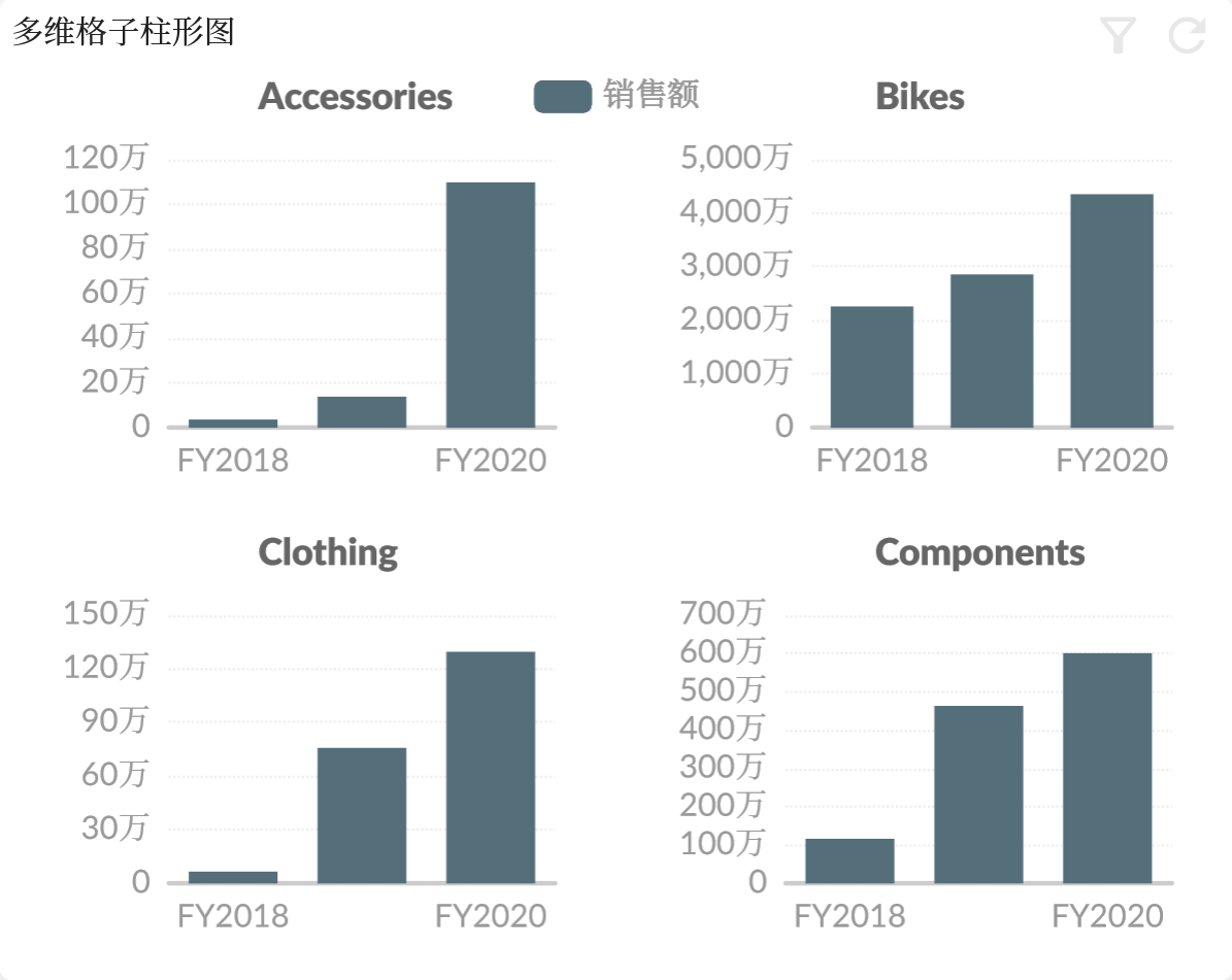
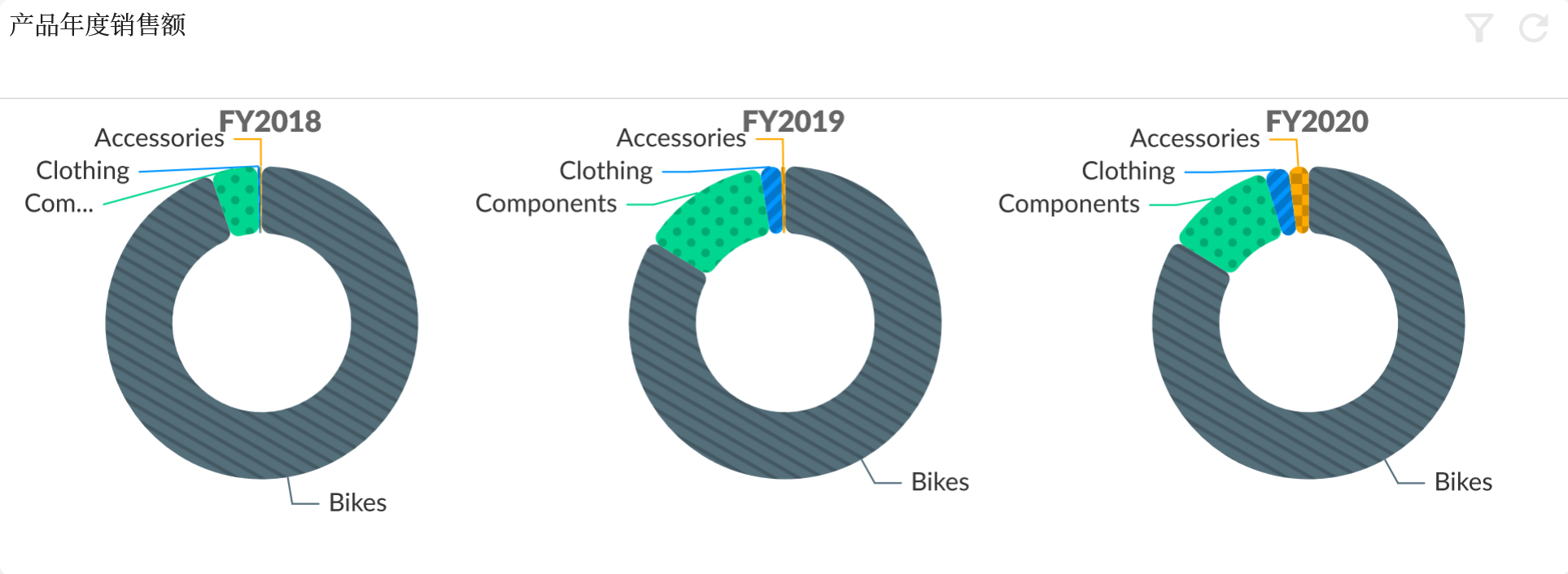
The trellis function is to analyze the charts in grid container and display the different members of a dimension as independent graphics in the form of grids.
By setting the role of the second dimension as Trellis, the members of this dimension can be used as the basis for dividing the grid members.
Refer to Bar#Trellis .
Data Zoom
The data zoom setting is based on the dimension or measure corresponding to the axis of the chart. For example, the x-axis of a chart corresponds to the calendar dimension. If you want to scale the x-axis, you need to enable it in the calendar dimension -> chart options -> data zoom and set detailed configuration.
For example, the y-axis of the chart corresponds to the sales amount measure. If you want to scale the y-axis, you need to enable it in the sales amount measure -> chart options -> data zoom and set detailed configuration.
Chart Variants
Chart Variants allows users to display different chart transformations in the same chart widget, so that users can choose the chart type they want to view according to their needs. Define multiple chart variants in the same chart widget in advance. These variants can be charts of different types, such as line charts, bar charts, pie charts, etc., or custom chart types, or they can be the same type of chart. Different display forms, such as stacked bar charts and grouped bar charts.
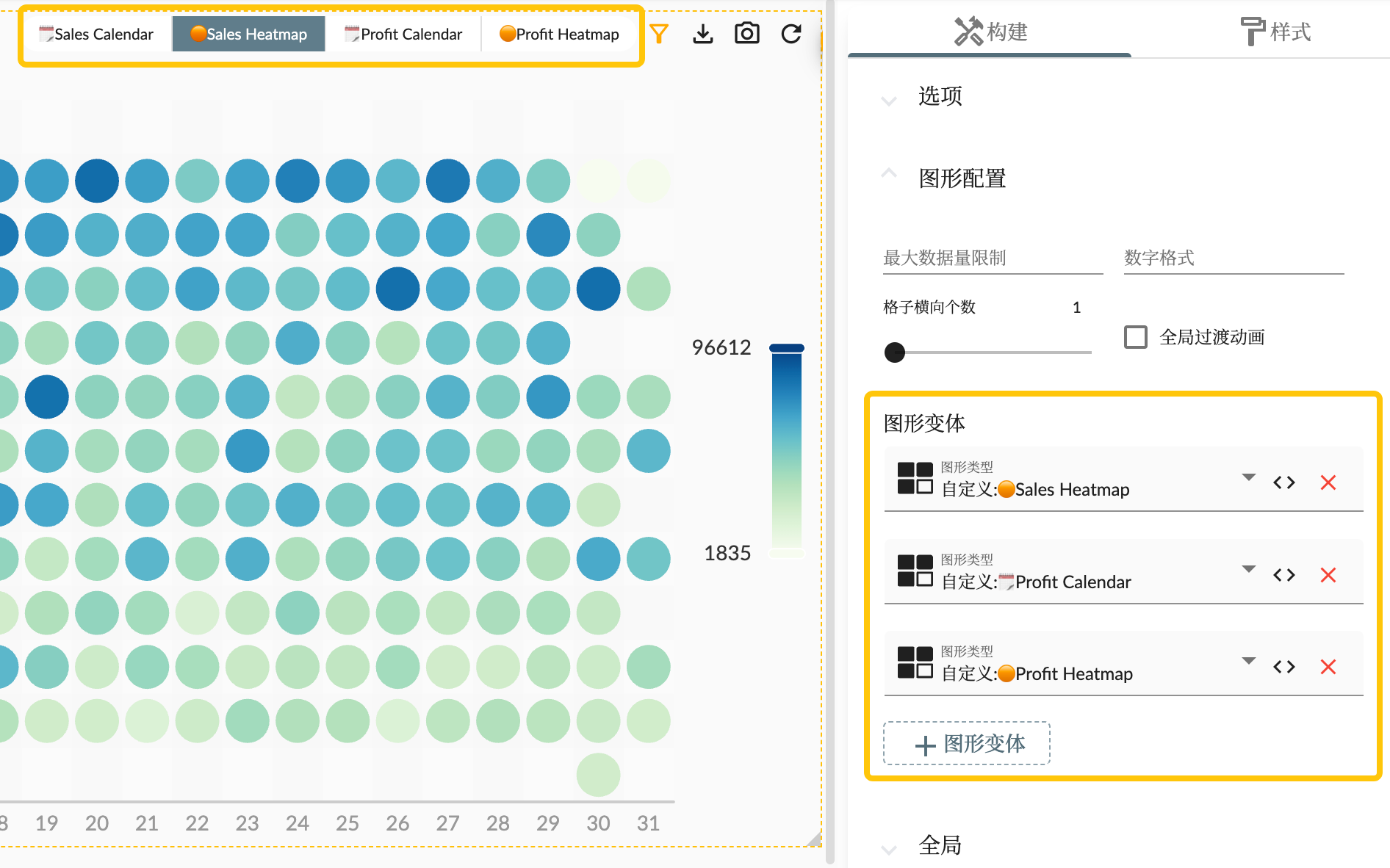
After adding chart variant in the chart configuration properties area, it will be displayed in the toolbar of the chart widget together with the type of the chart itself. Users can switch different chart variants to view different chart display effects.
Switching charts does not involve data changes, so data will not be queried repeatedly.
Measures
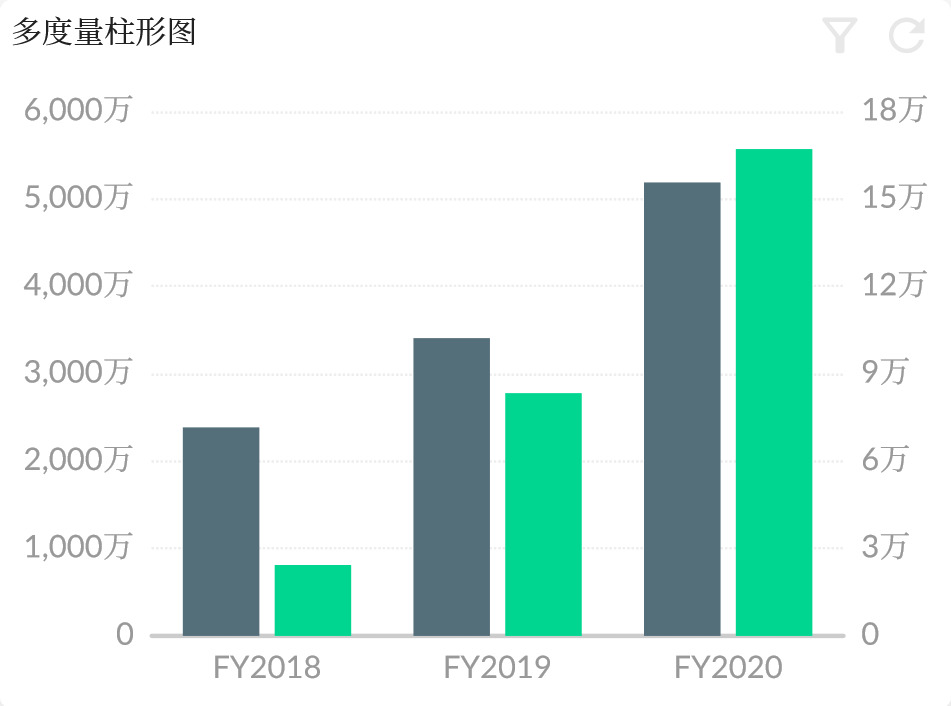
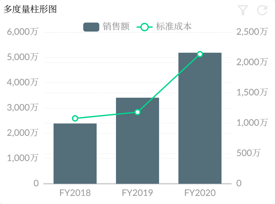
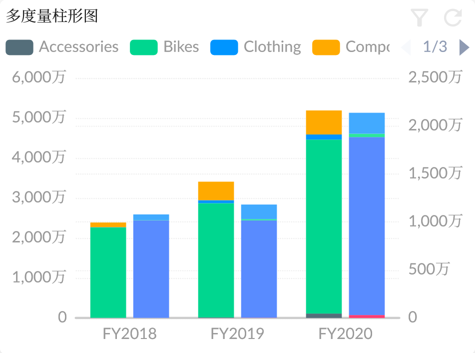
The Measure Selector allows users to select and view specific measures of a model. It can be used to display statistical data or data in a graphical form. The measure attribute setting component of the chart widget includes both generic measure selector functions and measure attribute settings for chart.
Generic Features
This feature allows users to select measures according to their needs, such as ordinary measures, calculated measures, and indicators. Users can choose the measures they want to display according to the actual needs or create calculation member measures for local calculations (without affecting the model itself). For generic measure selector functions, please refer to Measure Selector.
Chart-related Attributes
- Role: This is to define the role or responsibility of the measure in the graph. Such as the axis, legend, size, or color in the graph, etc.
- Shape: This is the setting to define the shape of the graphical data series, such as Bar, Line, Scatter, etc. In some chart types, such as scatter plots, the specific shape type of data points can be defined by the Symbol attribute in Series.
- Pattern: This is the setting to define the pattern of the chart. For example, by setting the fill pattern of the bar graph (diagonal line fill, dot fill, etc.).
- Color Palette: The color picker allows you to specify colors for different parts of the data graph. Users can choose a preset color palette, or they can create their own custom palette.
- ECharts Attributes: This includes the attribute settings corresponding to the measure in ECharts, such as Series, Axis, Visual Map, Data Zoom, etc.
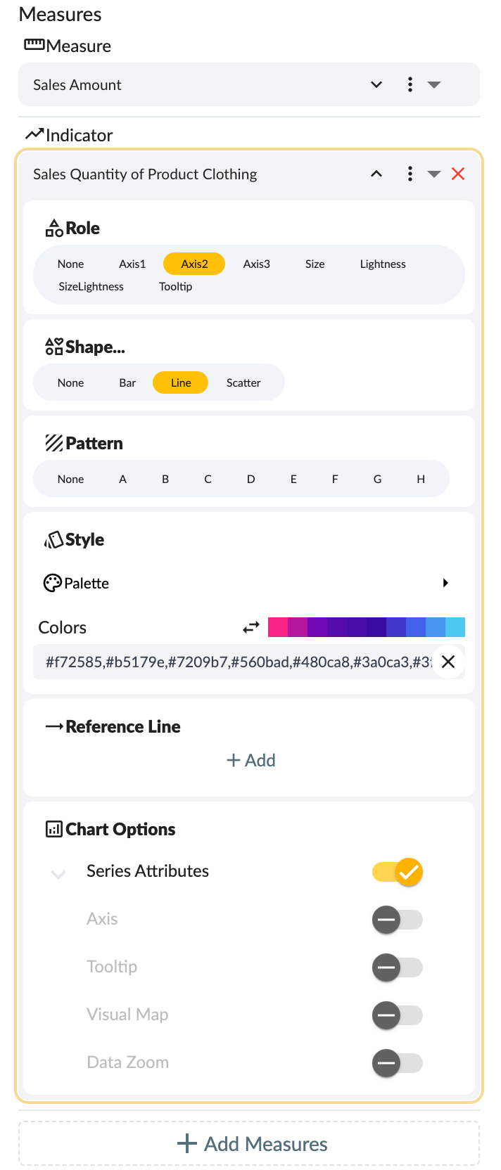
Such settings for the measure selector allow users to highly customize their measure display methods, so that data can be presented in a better and more intuitive way in the chart.
Dimensions
Dimension Selector allows users to select and view different dimensions of the model, which can display statistical data such as categories or chart data display. Features include general dimension selection functionality and chart attribute configuration related to dimensions.
General Function
The general dimension selection function supports users to select and view various dimensions of data according to their needs, such as product type, geographical location, time period, etc. According to specific requirements, you can select the corresponding dimension for data analysis and display. For more detailed functions, you can refer to the general Dimension Selector function.
Chart-related Attributes
Role: the role played by the dimension in the chart. The optional values are:
- Category: the category of data. For example, if your data set includes a product and sales, then the product is a category.
- Category2: the second category of data. Some graphics may use two category dimensions.
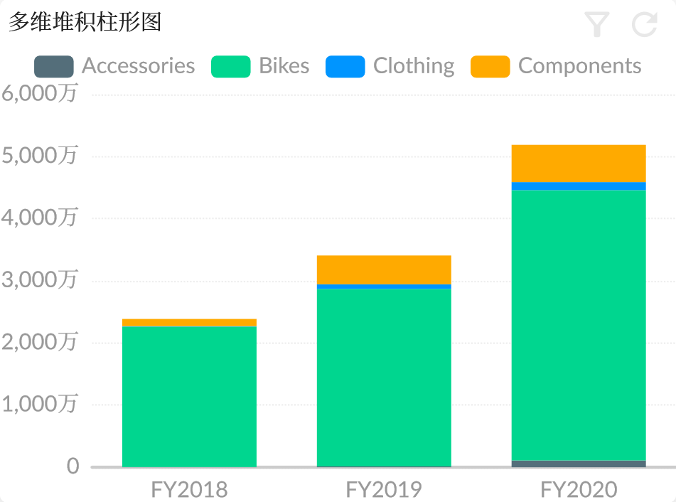
- Stack: stacked data. In a bar or line chart, it can represent the effect of stacking data of different categories together.
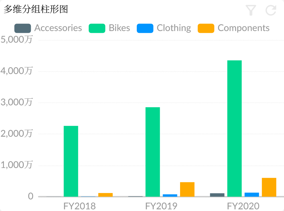
- Group: grouped data. In a bar or line chart, it can represent the effect of putting different categories of data together.
- Grid: in Trellis Chart, different grids represent different categories of data sets.
ECharts configuration attributes: this includes some configuration attributes of the dimension in ECharts, such as:
- Axis: coordinate axis setting. This determines the position and display format of the data in the chart.
- Data Zoom: data zoom and slide. This function allows zooming in or out of a region of data for a more detailed view.
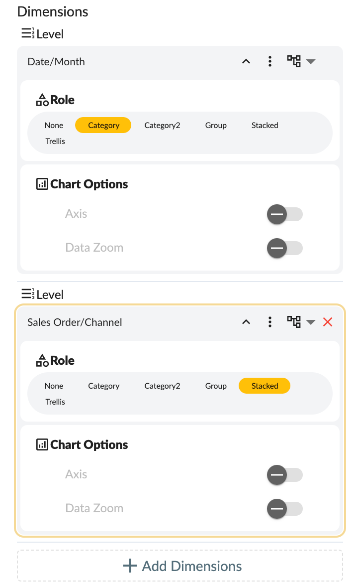
The above dimension selector settings allow users to configure the display of dimensions according to their needs, so that data can be displayed in the chart in the most intuitive, clear, and personalized way to meet the needs.
Chart Type
Support a wide range of chart types and chart variants.
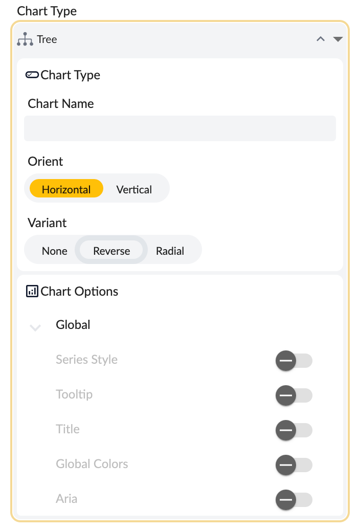
- Graph type selection
- Custom chart name
- Direction: horizontal, vertical
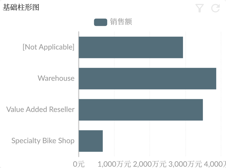
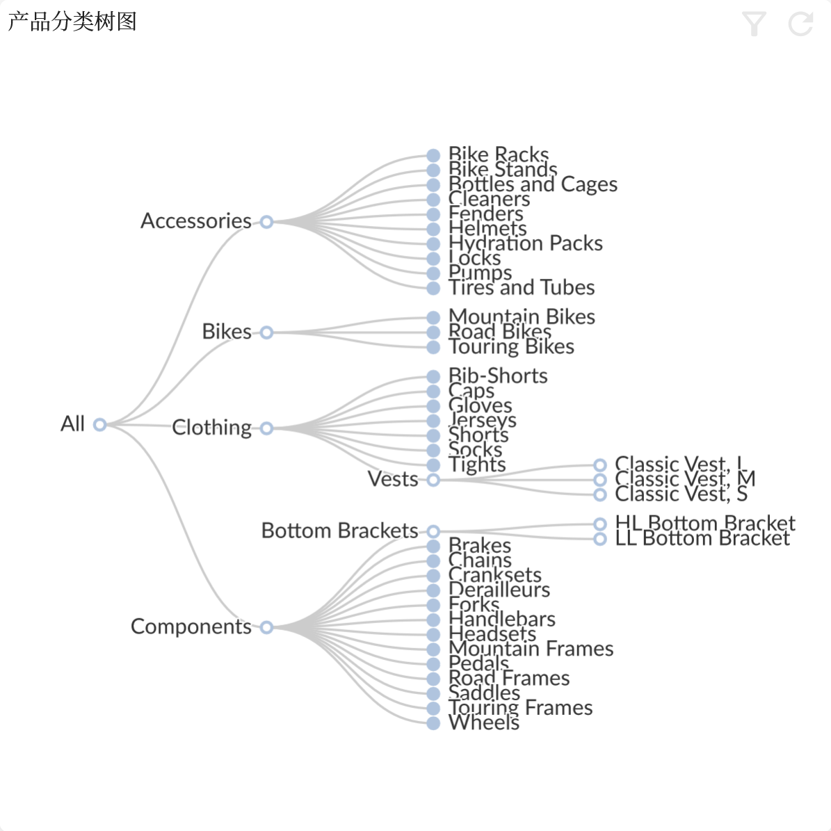
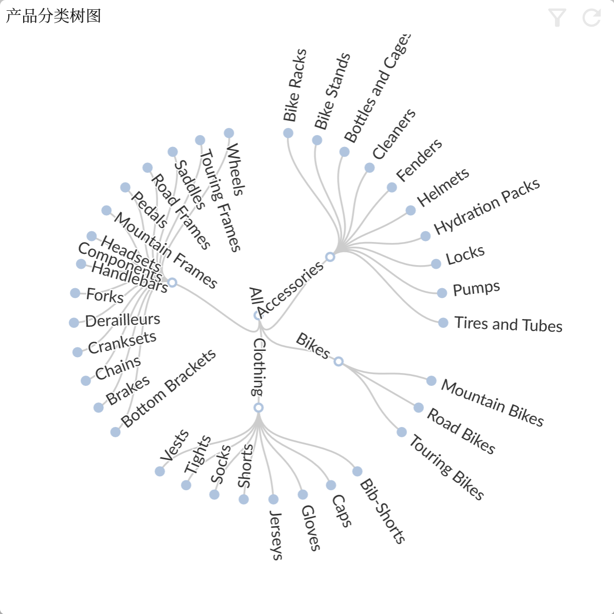
- Deformation: Different chart types may have different types of character deformation, such as the stack, grouping, polar coordinates, etc. of the bar chart, and the reverse, radar, etc. of the tree chart.
- Graphics configuration: Unified configuration of ECharts chart properties
- Grid: Grid component configuration, see ECharts Grid
- Series Uniform Attribute: Overwrite all ECharts series configurations, see ECharts Series
- Prompt box: Tooltip, see ECharts Tooltip
- Legend: Legend, see ECharts Legend
- Data Zoom: DataZoom, see ECharts DataZoom
- Global color: Set the global color sequence, see ECharts Color
- Auxiliary enhancement: , see ECharts Aria
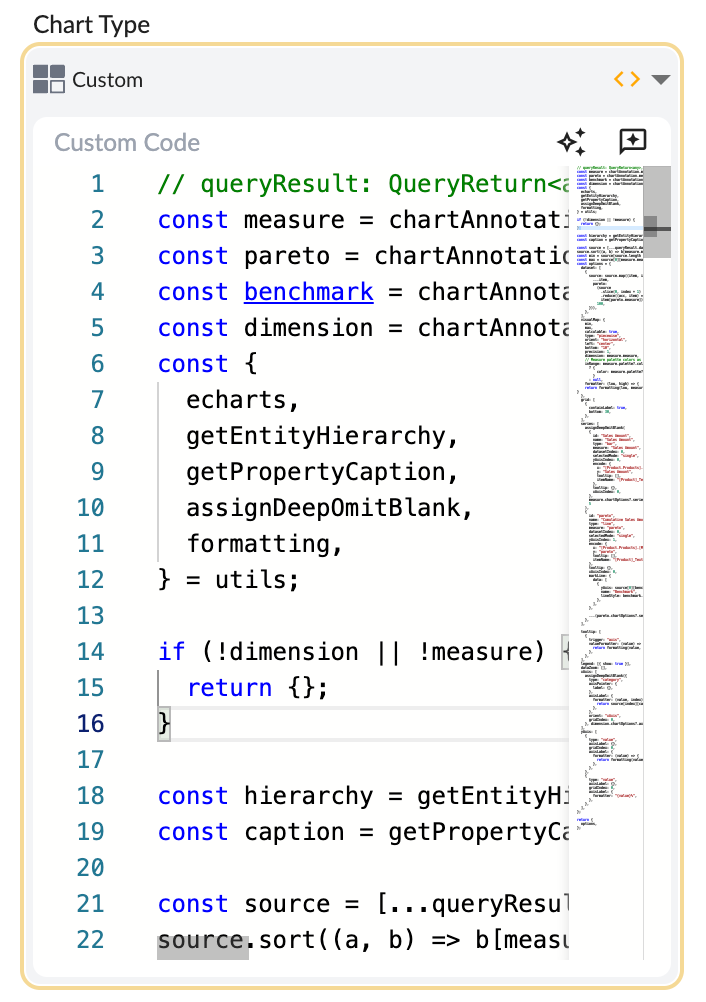
- Custom Chart Script Allows users to customize chart display by writing chart drawing script code.
Comparison Chart
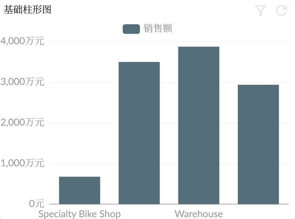
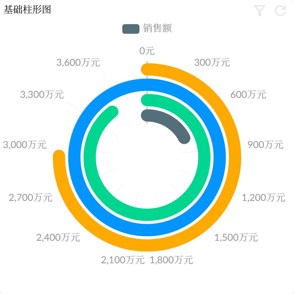
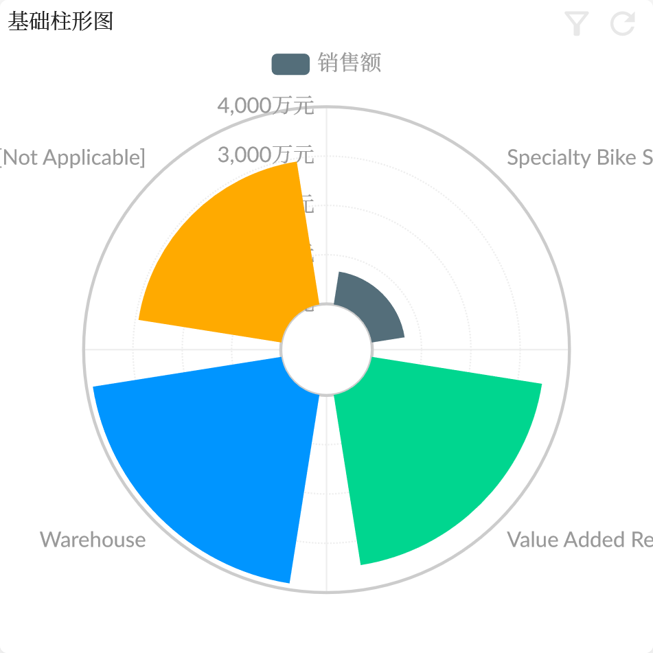
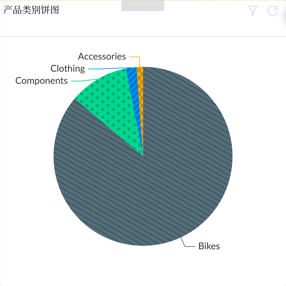
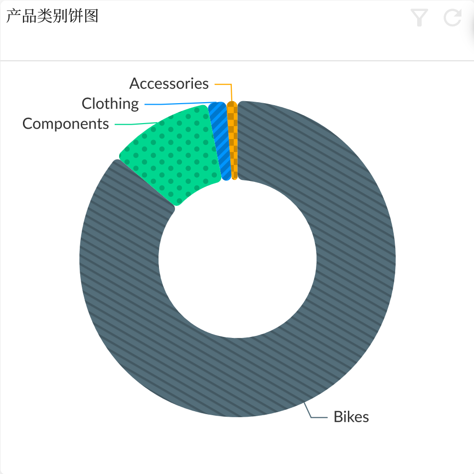
Comparison Chart is a class of chart types used to compare differences or similarities between two or more data series.
Bar
Pie
Trend Chart
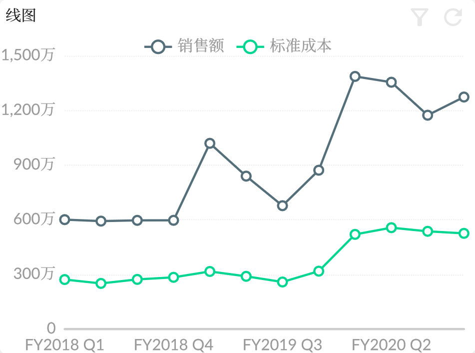
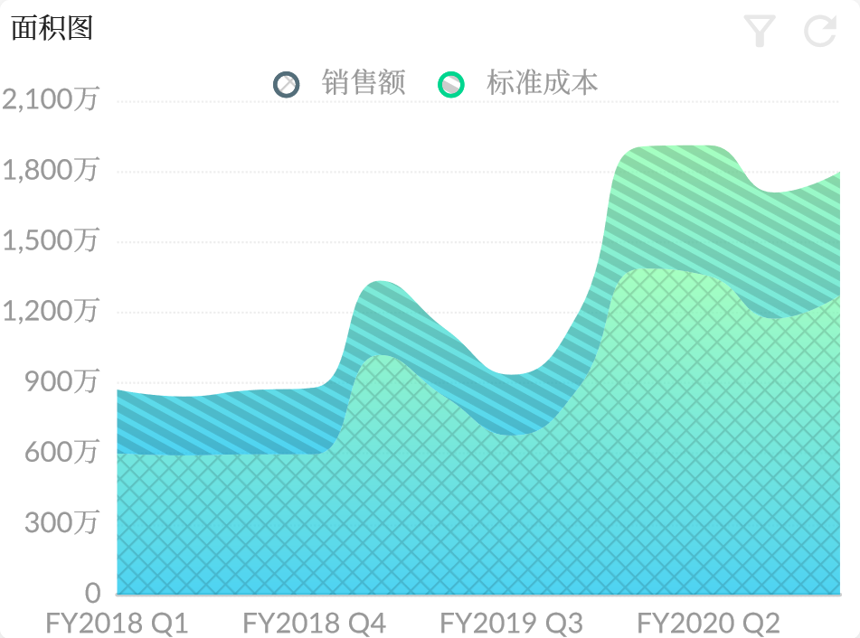
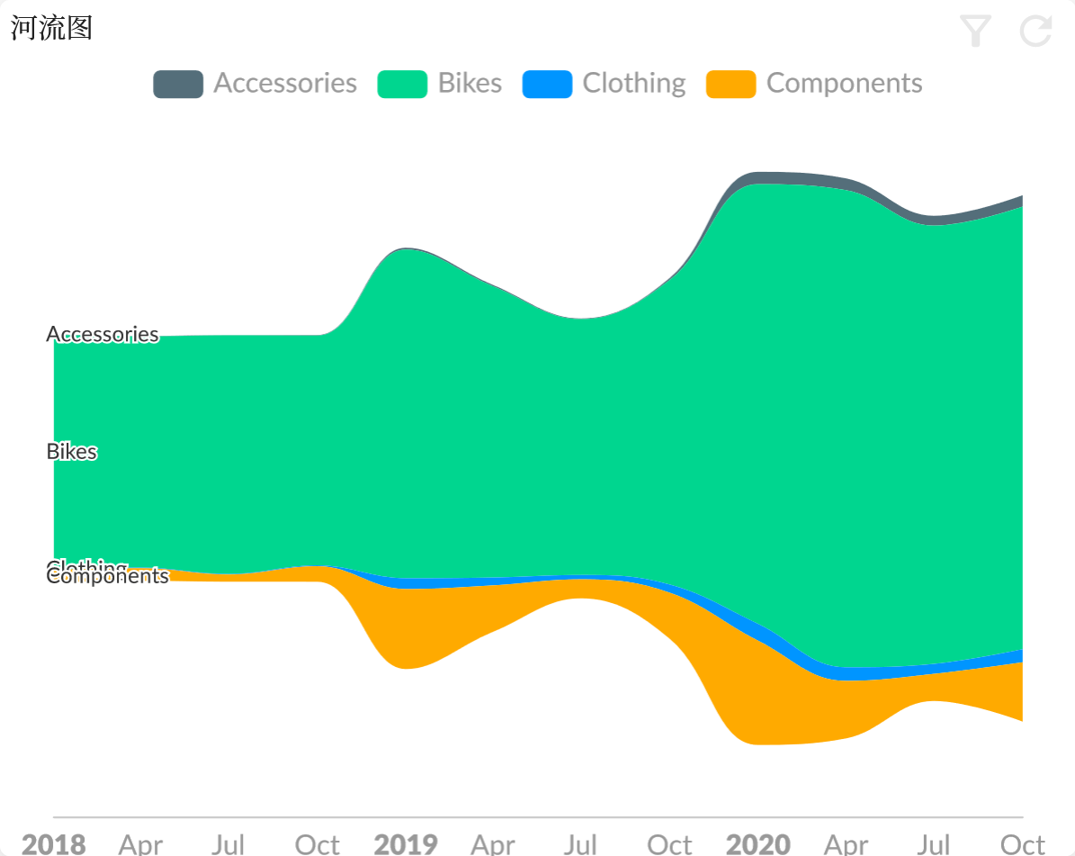
Trend Chart are a type of chart used for showing the trend of data. They are used to display the trends of data changing over time and can provide information about the data, such as whether there are trends, periodicity, and seasonality.
Line
Teme River
Correlation Chart
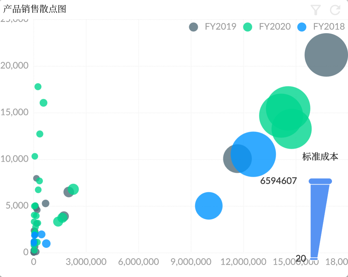
Correlation Chart is a type of visualization tool that displays the relationship between two measures.
Scatter Chart
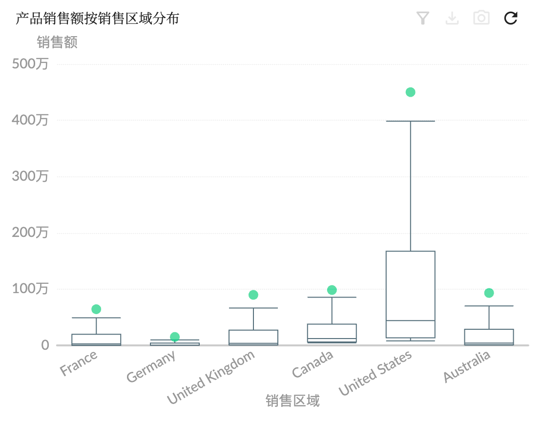
Distribution Chart
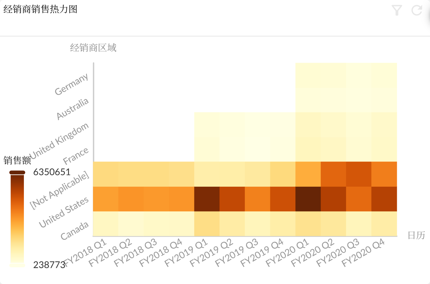
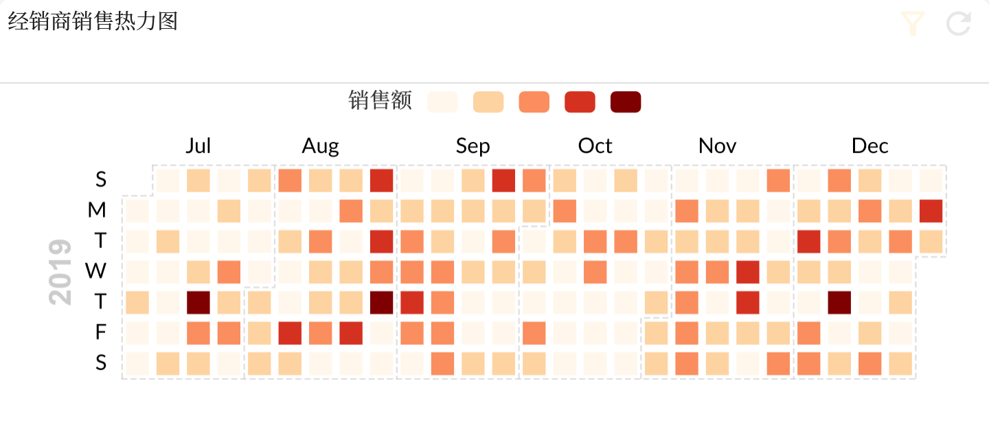
Distribution chart is a visualization tool for displaying data distribution. It can help users better understand the distribution of the data set, so as to make more accurate analysis and decision-making.
