💻 Devices
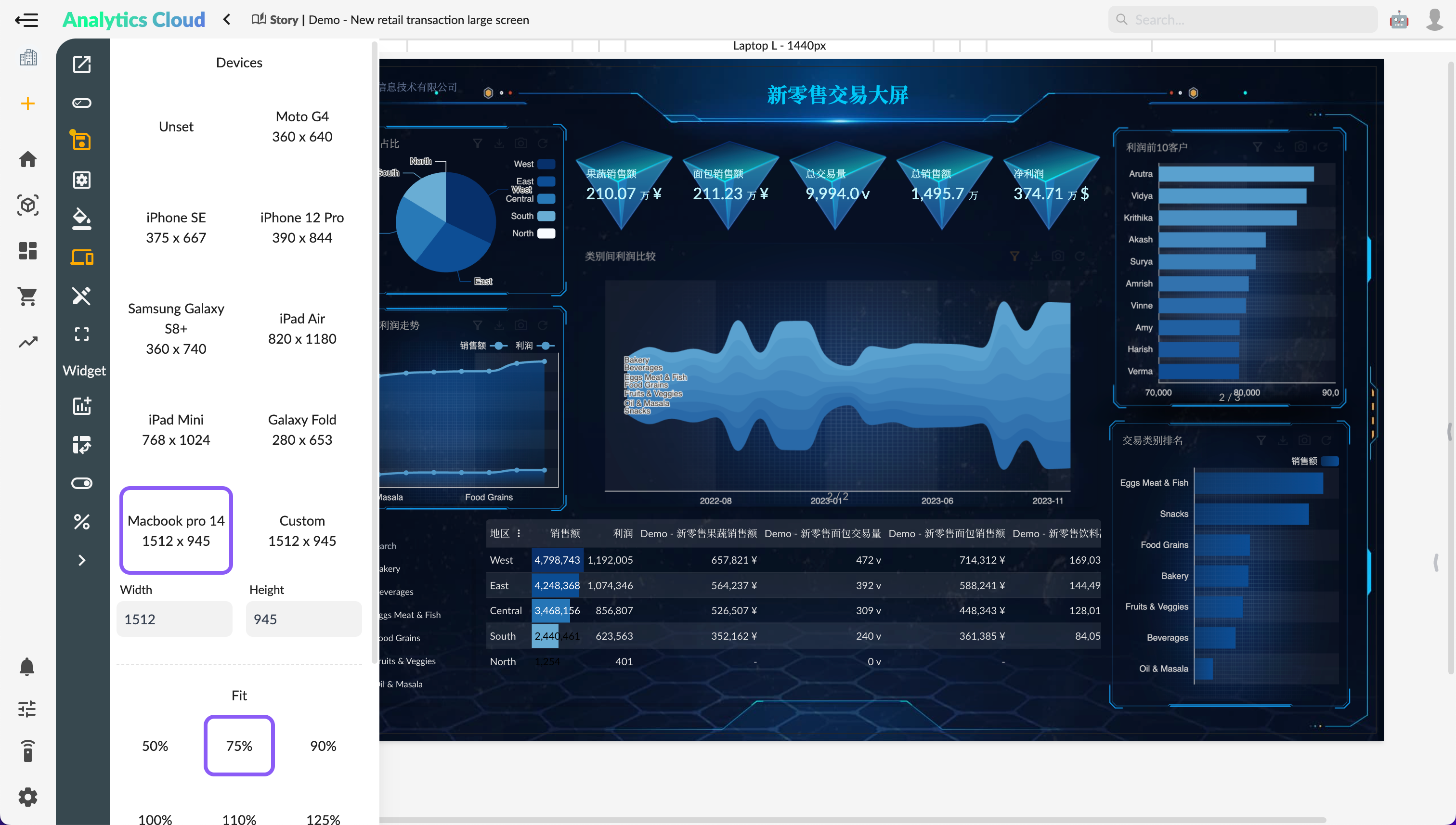
When building a story, you can simulate page layouts for different device environments using a set of device-related buttons available in the toolbar.
After selecting the simulate device button, the story editor will display in the size of the simulated device:

- Device type
- Custom device size
- Device display scale (only effective in design mode)
- Device orientation (only effective in design mode)
Simulated device size affects both editing and viewing modes on desktop devices, with the story dashboard scaling based on the simulated device size and the actual size of the container. However, on mobile devices, the simulated device type does not apply in the browsing mode (the actual device type is used instead).
Mobile Devices
For details on mobile devices, refer to Mobile Devices.