🎨 Global Styles
The global styles in the story dashboard toolbar offer a range of features that help you set and adjust the appearance and style of the entire story dashboard globally.
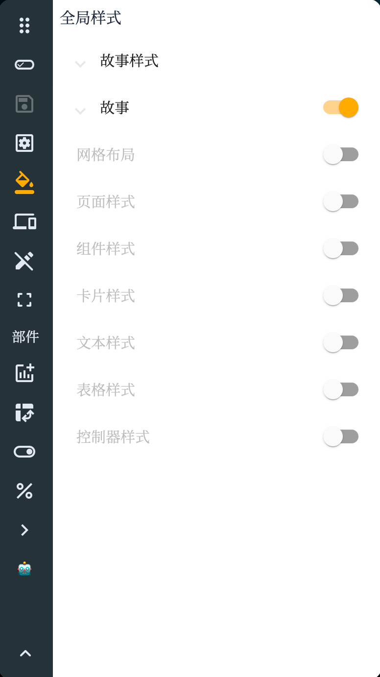
Story Styles
The story styles feature allows you to define the overall style of the story dashboard, including background color, font style, title style, etc. You can choose preset style themes or customize styles to ensure the story dashboard aligns with your brand or design needs.
Story Settings
The general story settings feature allows you to adjust the global behavior and settings of the story dashboard. You can define autoplay for stories, auto-loop, the display and behavior of navigation buttons, and other settings related to story navigation and interactivity.
| Name | Value | Description |
|---|---|---|
| Tab Bar | Fixed Floating Hidden | Type of title navigation for multiple story pages |
| Tab Bar Position | Top Bottom | Position of title navigation for multiple story pages |
| Tab Bar Alignment | Start Center End | Alignment of title navigation for multiple story pages |
| Tab Bar Stretch | Boolean | Whether the tab stretches to align both ends |
| Page Navigation Show Labels | Boolean | Whether to show text labels |
| Appearance | Unified appearance settings for components | |
| Display Density | Comfortable Medium Compact | Display density of components |
| Form Field Appearance | Standard Filled Outlined | Appearance of form field components |
| Form Field Floating Label | Always Never Auto | Floating mode of form field component labels |
| Theme | Follow System Light Dark | Theme of the story dashboard |
| Color | Color Sequence | Color sequence for story dashboard graphics and other widgets |
Color Modes
The color theme used in the story has four modes:
- Default: The story's color mode follows the system.
- Light Mode: Light and bright color mode.
- Dark Mode: Dark and black color mode.
macOS System Color Mode:

Watermark Configuration
The watermark configuration feature allows you to add a watermark to the story dashboard. You can upload a custom watermark image or choose a preset watermark style and adjust its transparency and position. Watermarks can be used to protect your content or add additional brand identification.
| Name | Value | Description |
|---|---|---|
| Text | Text | Text of the watermark |
| Opacity | ||
| Angle | ||
| Width | ||
| Height | ||
| Font | General font style settings | Font style of the watermark |
Story Styles
Use raw CSS properties for detailed configuration of story components.
Grid Layout
The page configuration feature allows you to set and adjust individual pages. You can set the background color, background image, and page transition effects. Additionally, you can set independent transition effects and durations for each page.
Page Styles
Style settings for story point pages, general style configuration. Same as story styles.
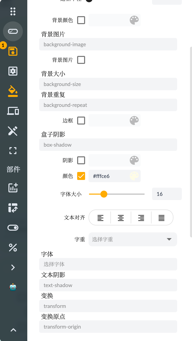
General Component Styles
The general component styles feature allows you to define style settings shared by all components. You can set default colors, font styles, line styles, etc., for charts. These style settings will automatically apply to all newly added components, ensuring a consistent appearance and style.
Card Component Styles
The card component styles feature allows you to adjust the style settings of card components. You can set background color, border style, shadow effects, etc., to make card components stand out in the story dashboard or align with other components.
Text Component Styles
The text component styles feature allows you to define the style settings of text components. You can set font style, font size, alignment, etc. Additionally, you can choose the color and background color of the text and add links or formatted text.
Table Component Styles
The table component styles feature allows you to adjust the appearance and style of table components. You can set header styles, row styles, cell styles, etc. By customizing table styles, you can make data easier to read and understand.
Input Controller Styles
The input controller styles feature allows you to define the style settings of input controller components (e.g., sliders, filters). You can set the appearance, color, size, etc., of sliders, as well as the style and option layout of filters.
By using the global styles feature in the story dashboard toolbar, you can easily adjust the appearance and style of the story dashboard, ensuring overall consistency and personalizing it according to your brand requirements. These style settings help enhance the visual appeal and user experience of the story dashboard.