📐 Page Layout
In the story dashboard workspace, when you create an empty story dashboard, you have two options to start designing your dashboard layout:
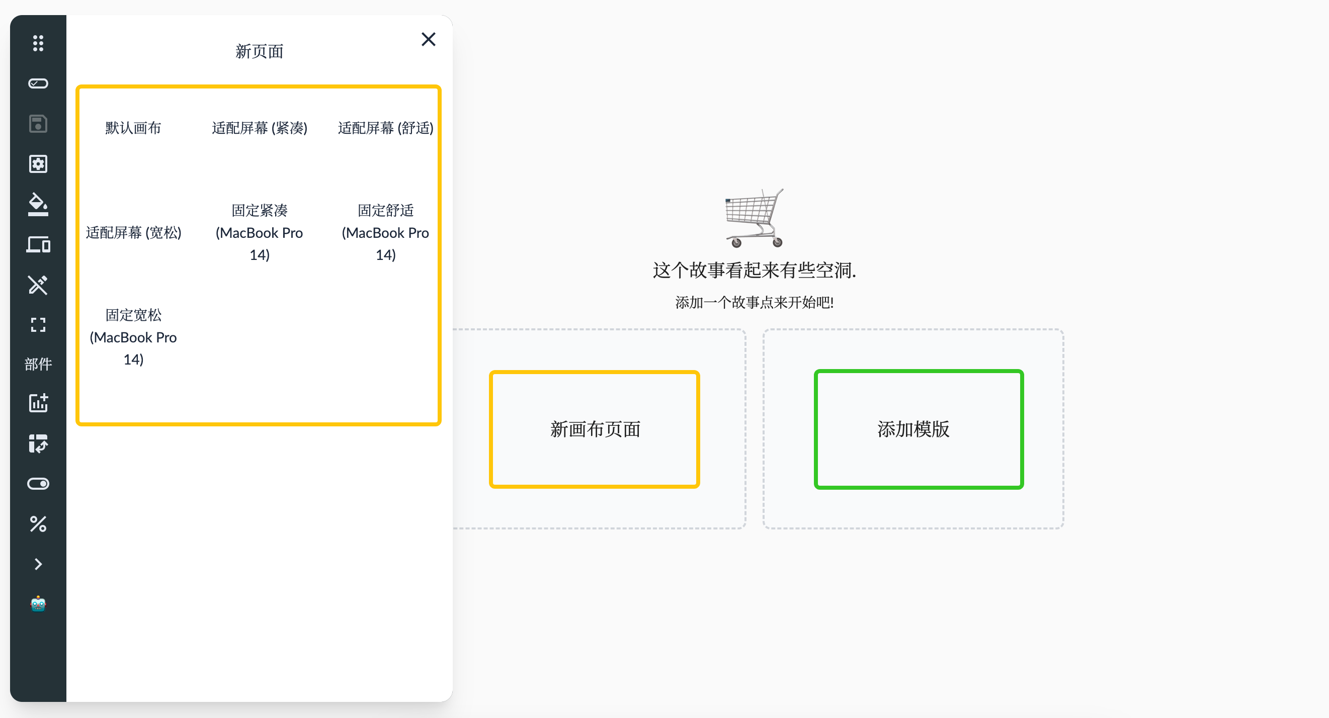
Add Canvas Pages with Different Layout Types: In the story dashboard workspace, click on “New Canvas Page” in the wizard, or click on “Preferences” -> “New Page” -> “Different Types of Pages” in the toolbar. You can add multiple canvas pages and choose different layout types to meet your needs. The layout type defines how components are arranged and sized on the canvas. You can select the layout type based on your data and visualization needs. Here are some common layout types:
- Fit to Screen Layout: Components on the canvas automatically resize to fit different screen sizes and resolutions.
- Fixed Size Layout: Components on the canvas maintain a fixed size and do not change with screen size or resolution.
- Fixed Height Layout: Components on the canvas maintain a fixed height, but their width changes with the screen size and resolution.
Add Story Templates for Quick Dashboard Creation: The story dashboard workspace also provides pre-designed story templates that help you quickly create a dashboard and get started. These templates include common dashboard layouts and example charts that can be directly applied to your blank story dashboard to quickly generate the initial structure. You can modify and customize the templates to suit your data and analysis objectives. Using story templates can save time in designing the dashboard while providing inspiration and guidance for layout and visualization. For more details, refer to Story Templates.
In addition to using predefined canvas types, users can also customize the canvas settings. Open the story properties editing interface, and click on a blank area of the page to bring up the grid layout settings. The grid layout has the following properties:
- Layout Type:
- Fixed: Fixed pixel layout, with grid size determined by fixed column width and fixed row height.
- Fixed Size not set: The initial number of columns in the grid is calculated based on the screen width, and the initial number of rows is determined by the minimum number of rows.
- Fixed Size set: The initial number of columns and rows in the grid is determined by the minimum number of columns and minimum number of rows, and you can expand the grid beyond the current area by dragging widgets. The grid will be centered.
- Fit to Screen: Screen size-adaptive layout, where the number of grids is determined by the minimum number of columns and minimum number of rows. The grid size is not fixed (fixed column width and row height are not applied) and fills the entire screen size.
- Scroll Vertical: Vertical scrolling layout, where the initial number of grids is determined by the minimum number of columns and minimum number of rows, and the grid size is adjusted to fill the screen width. The grid height and width are the same, and the layout scrolls vertically.
- Scroll Horizontal: Horizontal scrolling layout, similar to the vertical scrolling layout.
- Vertical Fixed: Fixed vertical size layout, where the vertical grid height is determined by fixed row height and the initial number of rows is based on the minimum number of rows. When it exceeds the screen height, scrolling occurs. The horizontal grid width adjusts to fill the screen width based on the minimum number of columns.
- Horizontal Fixed: Fixed horizontal size layout, similar to the vertical fixed size layout.
- Fixed: Fixed pixel layout, with grid size determined by fixed column width and fixed row height.
- Grid Display: When to display the grid – never, always, or when dragging.
- Compact Type: Direction for automatic compact processing.
- Edge Padding: The padding size around the grid, including the space between grids.
- Margins: Whether to keep the outermost margin of the grid.
- Layering: Allows overlapping positions between widgets.
Integration with Devices
The device simulator is responsible for simulating the size of the device where the story is displayed. By combining different layout types with different device sizes, the display effect can be better adapted to various devices.
- Fit to Screen Layout: When combined with a fixed-size desktop device screen, it allows the content to adapt to the device’s width or height.
- Fixed Size Layout: Used in scenarios where the content size is fixed and no device simulation is applied.
- Fixed Height Layout: When combined with a vertical mobile device simulator, it allows width to fill and height to scroll.
- Fixed Width Layout: When combined with a horizontal mobile device simulator, it allows height to fill and width to scroll.
For more details, refer to Devices.