📱 Mobile
When building a story, the page layout construction for mobile environments can be achieved through a set of device-related buttons provided in the toolbar.
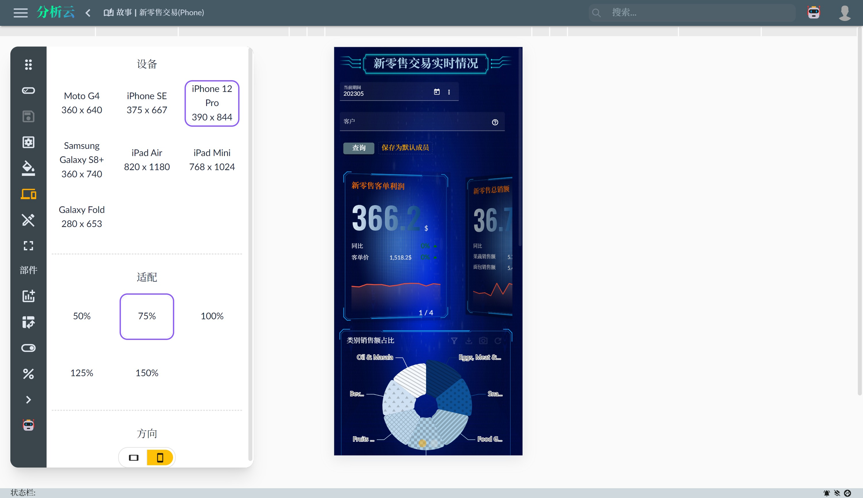
Once the mobile device button is activated, the story building page will be displayed in a mobile device-sized mode:

- Device Model: The button menu allows you to choose from common mobile device sizes.
- Adaptation: Scale the mobile device size for easier viewing of the overall effect or details.
- Orientation: Switch the handheld orientation of the mobile device: landscape or portrait.
- Foldable Device: If the selected mobile device is a foldable one, click this button to toggle the device's fold/unfold state.
Page Layout Adjustment
In the mobile device environment, the page layout needs to be adjusted accordingly. By default, the canvas page uses a fixed-size layout. On mobile devices, a vertical scroll layout type should be used so that the page adapts to the device width horizontally and scrolls vertically.
- Minimum Columns: Removed.
- Minimum Rows: Removed.
You can also choose the Fixed Height Layout type when creating a new canvas page. For more details, refer to New Canvas Page.