In the first article, we introduced how to enhance CDS models using the semantic modeling capabilities of Xpert Analytics Cloud.. This article will explore how to use these enhanced CDS models to create visual story dashboards for better data analysis and business insights.
Story dashboards are a crucial component of Xpert Analytics Cloud's embedded analytics. They help users gain a comprehensive understanding of their business from multiple dimensions and levels through rich visualization features and interactive operations. This article will introduce the key features of creating story dashboards, including calculation measures, filter bar widgets, input controls, key metrics widgets, chart widgets, and grid table widgets. Combining these features can create a story dashboard as shown below:
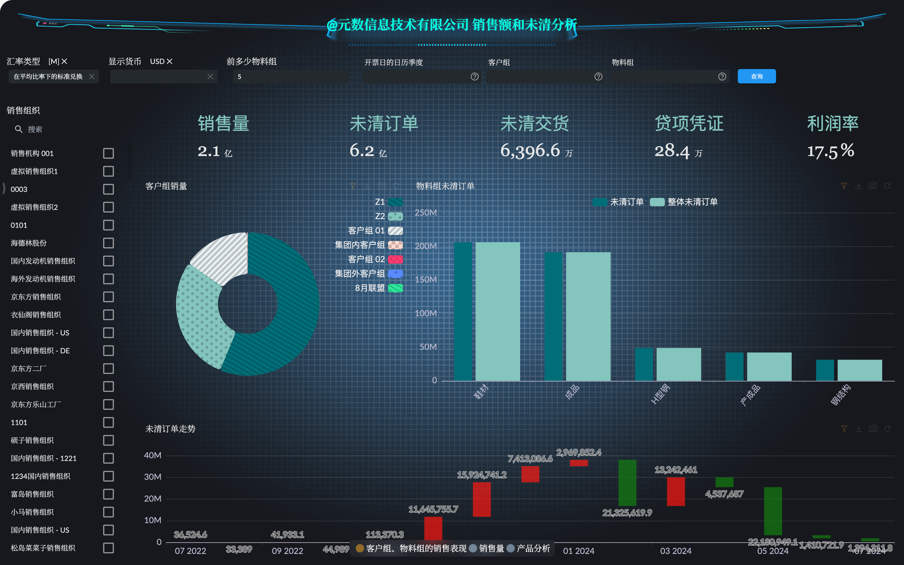
This series of SAP S/4HANA embedded analytics feature introductions will be explained in three parts:
- Semantic Models: Explore how to enhance CDS models using Xpert Analytics Cloud's semantic modeling capabilities, including defining calendar semantics and creating calculation measures using MDX statements, laying the foundation for subsequent story dashboards and KPI management.
- Story Dashboard: Introduce how to create visual dashboards using enhanced CDS models to create rich and diverse stories and calculation measures.
- KPI Management: Discuss how to define a series of KPIs for CDS models to form a systematic KPI management function, making it easy for enterprise managers to subscribe to and analyze KPIs and monitor business data in real time.
Background Review
The CDS Views in the SAP S/4HANA system development package VDM_SD_ANALYTICS are SAP-provided standard views for sales analysis. We chose the Sales Quantity and Outstanding Sales query view for analysis, with the related CDS views as follows:
- Analysis Catalog:
2CISDSLSANACUBE1Analysis - Sales Quantity and Outstanding Sales - Query
2CISDSLSANACUBE1/2CCSDSLSANALYTICQ1Analysis - Sales Quantity and Outstanding Sales
@Analytics.query: true
@AbapCatalog.sqlViewName: 'CSDSLSANALYTICQ1'
define view C_SalesAnalyticsQry_1
@Analytics.dataCategory: #CUBE
@AbapCatalog.sqlViewName: 'ISDSLSANACUBE1'
define view I_SalesAnalyticsCube_1
We created the corresponding semantic models and enhancements. Next, we will use the Sales Quantity and Outstanding Sales semantic model to create an analysis story dashboard.
The following steps assume we have already created the basic story dashboard panel.
Calculation Measures
Calculation measures are new metrics derived from existing data through formulas, making them flexible enough to adapt to different business needs. In story dashboards, calculation measures can be used in conjunction with parameters for dynamic calculations in various contexts. For detailed documentation, see How to Create Calculation Measures.
Creating Calculation Measures
For example, if we want to analyze the sales quantity and total sales quantity of the top percentage of products, this highly detailed calculation requirement can be met by creating calculation measures in the Xpert Analytics Cloud story dashboard. Calculation measures in story dashboards can also be used with parameters for more flexible and varied data analysis.
Click the Preferences option in the story toolbar, open the Preferences toolbar, then open the Calculation Members button and go to the Calculation Members interface:
Click the Create Calculation Member or Use AI to Generate button to create a new calculation measure.
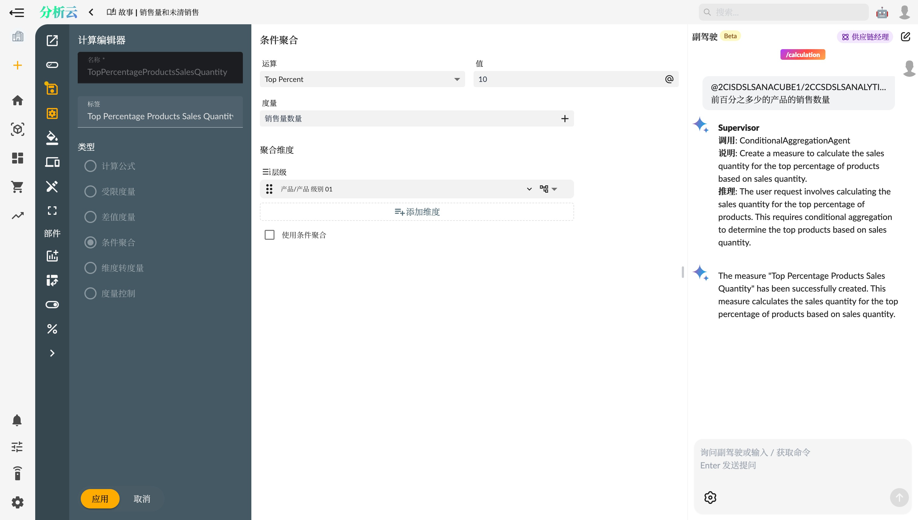
AI: Select the dataset and describe the business logic of the calculation formula, and Copilot will help you create the corresponding type of calculation measure.
Using Parameters
Using parameters in calculation measures can make the calculations more flexible. For example, you can control the percentage of Top Percent products based on user-selected percentages. After creating the parameter, the story will automatically add a corresponding input control for this parameter on the current page to control the parameter value.
Story Widgets
Filter Bar Widget
Filter Bar Widget is a global page filter tool that can set a group of filters on the dashboard, affecting the display data of all related widgets. With global filters, users can easily switch between different dimension members to view business data from different perspectives.
- Open the dashboard toolbar and select “Add Filter Widget.”
- Select the “Filter Bar” widget and drag it to the dashboard.
- Configure filter conditions, such as filtering by region, time range, or product category.
- Click Query, and the filter bar will automatically apply to all related widgets.
Input Control
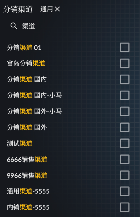
Input Control is used to control the selection of individual dimension members and link the filtering and screening functions of other widgets. For example, you can select a specific product category through the input control, thereby updating the data of all related charts and tables in the dashboard.
- Open the dashboard editor and select “Add Widget.”
- Select the “Input Control” widget and drag it to the dashboard.
- Configure the options of the input control, such as selecting product categories or time periods.
- Change the selection, and the slicer of the input control will link with other widgets.

Key Metrics Widget
The key metrics widget is used to display a single metric or a comparison of metrics, helping users quickly understand key business data. For example, you can use the key metrics widget to show the sales amount, profit margin, or customer satisfaction for the current quarter.
Chart Widget
Chart widgets support a variety of chart types and multi-dimension, multi-measure displays, helping users understand data more intuitively. For example, you can use bar charts, line charts, or pie charts to display sales trends, market shares, or profit compositions.
- Open the dashboard editor and select “Add Widget.”
- Select the “Chart” widget and drag it to the dashboard.
- Choose the chart type, such as bar chart, line chart, or pie chart.
- Configure the data source and display dimensions of the chart.
- Save the configuration, and the chart widget will be displayed on the dashboard.

Grid Table Widget
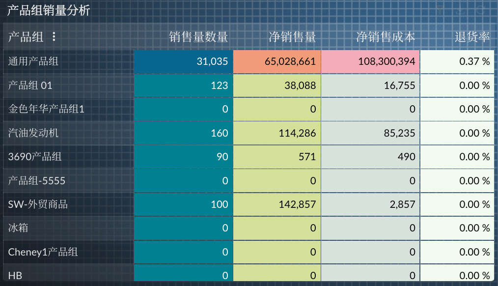
Grid table widgets display multi-dimensional, multi-measure data in table form and can also set cell styles to make the data presentation clearer. For example, you can use grid table widgets to display sales data for different regions, products, and time periods, and highlight specific data through conditional formatting.
- Open the dashboard editor and select “Add Widget.”
- Select the “Grid Table” widget and drag it to the dashboard.
- Configure the data source and display dimensions of the table.
- Set cell styles and conditional formatting, such as highlighting sales data that exceeds target values.
- Save the configuration, and the grid table widget will be displayed on the dashboard.
AI Copilot Commands
In the story dashboard designer, you can use various Copilot commands to help users create visual dashboards.
Copilot commands in story dashboards are still under development, so use them with caution.
Story Commands
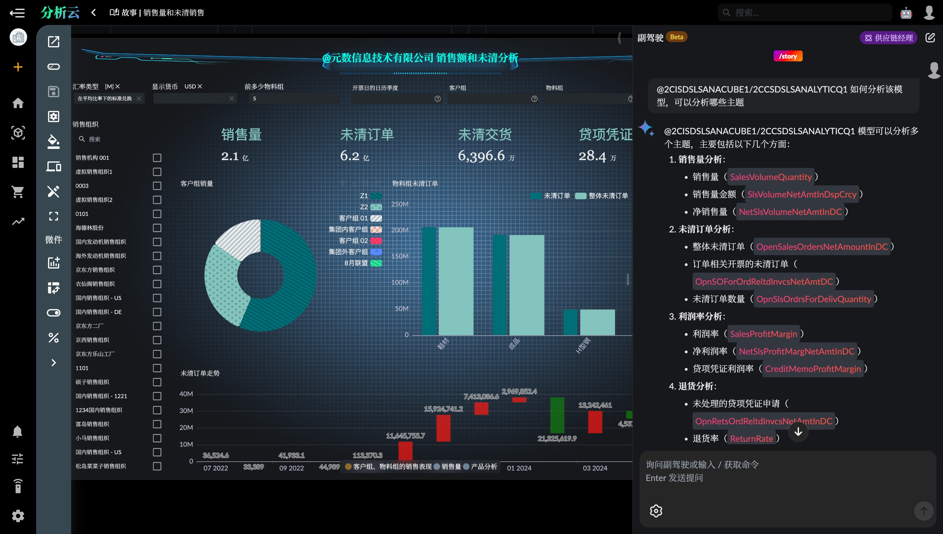
Story commands as super agents can coordinate the invocation of other sub-command agents to complete more complex tasks.
/story @2CISDSLSANACUBE1/2CCSDSLSANALYTICQ1 How to analyze the sales situation of products in the model
Calculation Measure Commands
Calculation measure commands can be used to create and modify calculation measures in the story dashboard.
/cc @2CISDSLSANACUBE1/2CCSDSLSANALYTICQ1 Create Return Rate: Credit Note Quantity/Total Sales Volume
Summary
Through this article, you can use enhanced CDS models to create rich and diverse story dashboards in Xpert Analytics Cloud. By using calculation measures, filter bar widgets, input controls, key metrics widgets, chart widgets, and grid table widgets, you can flexibly display and analyze business data. In the next article, we will explore how to define a series of KPIs for CDS models to form a systematic KPI management function.