
Xpert Analytics Cloud is a data visualization analysis platform. It provides a powerful story dashboard function, which includes the ability to customize graphic logic. This capability allows users to use common open source graphics libraries to display and manipulate custom graphics.
ECharts is an open source JavaScript chart library that provides rich visual chart types and interactive features, including line charts, bar charts, pie charts, radar charts, and more. Meta-analysis cloud integrates ECharts and provides the ability to customize graphic widget logic in the story dashboard feature so that users can create and customize graphics in a more flexible way.
With the ability to customize graphic logic, users can customize and interact with graphs by writing JavaScript code according to their own needs and data characteristics. Users can define the appearance style of the chart, data processing logic, interaction behavior and so on.
Story Dashboard Design
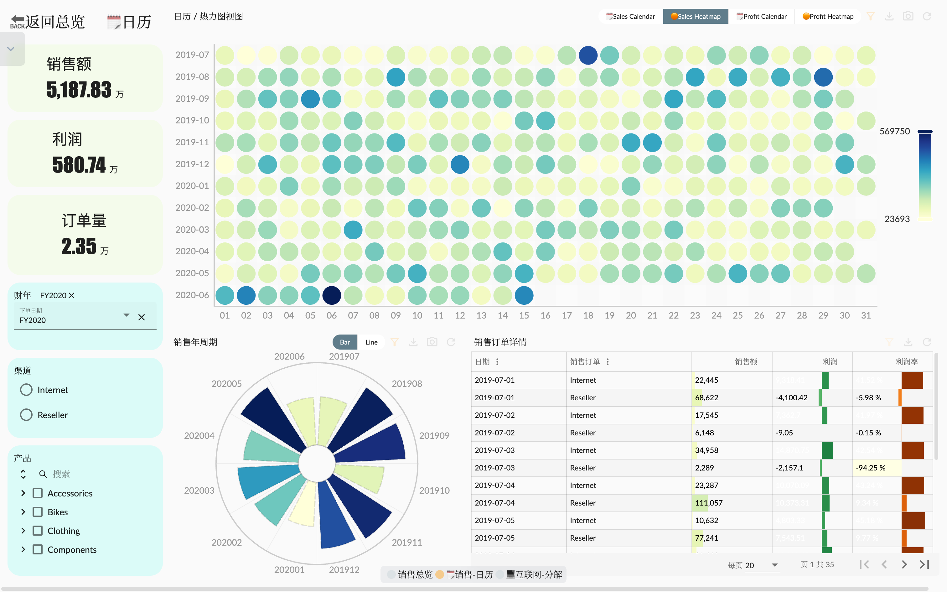
Continued from the last article Example: AdventureWorks Sales - 4. Story Dashboard The Sales Overview Page we created can provide a comprehensive sales data analysis, including various sales core indicators, product-related overviews, and sales channel overviews. In this article, we will analyze the core sales indicators in more depth, and use calendar and heat map to display sales data in order to better analyze the changes in sales data trends. Another page analyzes Internet sales (B2C Customers) data indicators, and decomposes and analyzes them by customer region.
Technology points
In this article, we only focus on the technical points involved in the story dashboard page, including the navigation between different pages, custom graph logic, and linked analysis.
Page Navigation
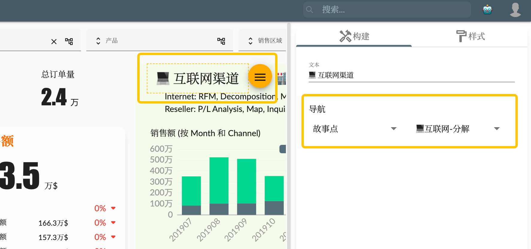
After we have created more story dashboard pages, in order to better organize the logical relationship between pages, we can use the page navigation function to implement it. In the story dashboard page, we can set the page navigation by setting the page navigation for the key indicator widget and text widget.
Custom chart logic
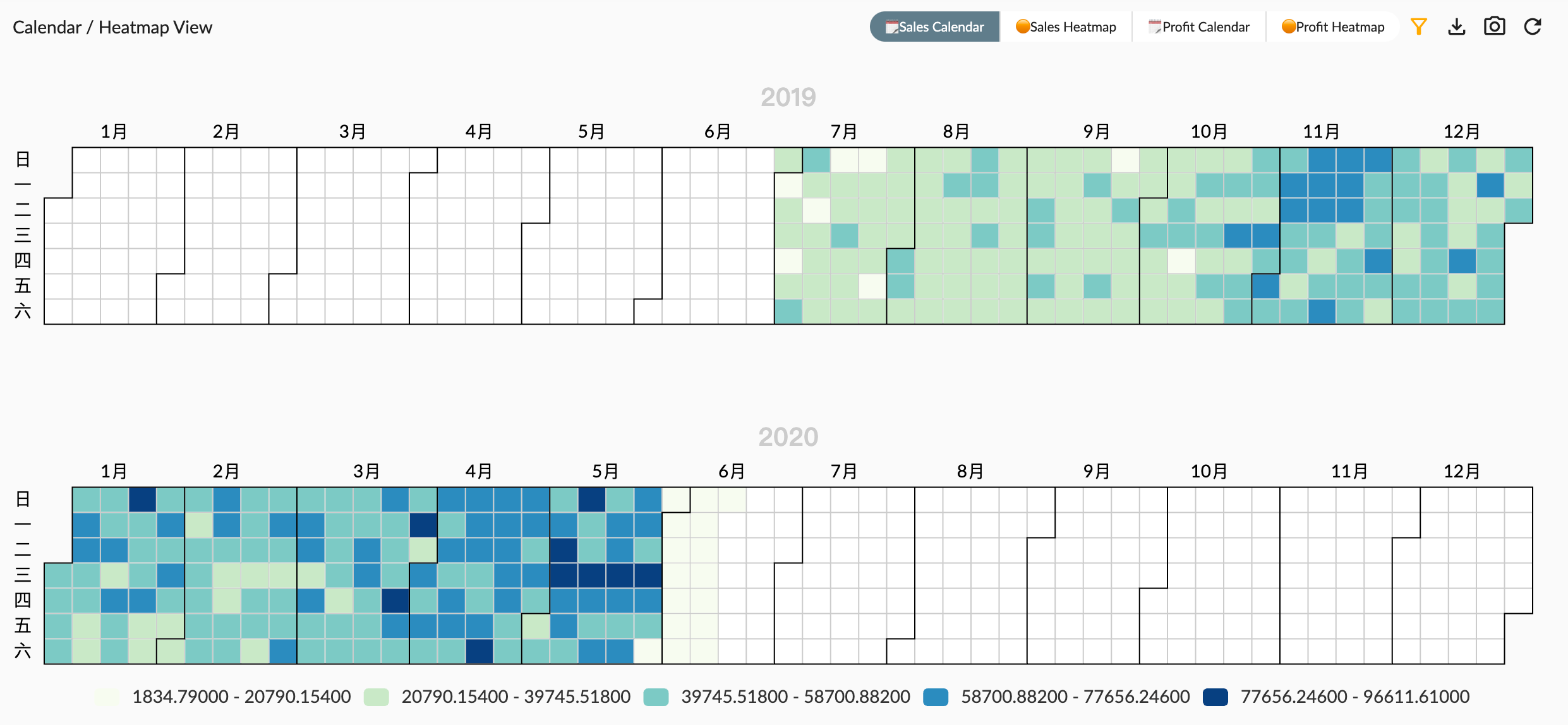
By using custom ECharts graphics logic, we can flexibly customize the style and display of the chart. Using the calendar chart, we can intuitively view the distribution and trend of sales data between different dates, helping us discover sales peaks and valleys, as well as sales patterns related to time. The heat map can display sales data in the form of color depth in the two-dimensional coordinate system of the month and the day of the month, helping us to understand the popular and unpopular time dates of the sales data in the month, and further explore sales opportunities and problems.
We take the sales calendar as an example to explain how to write custom graphics logic. This graphic logic divides the sales data to the day into groups according to the year, and the sales data of each year is displayed in the form of a calendar coordinate (Calendar coordinates ), and each calendar coordinate system is evenly distributed in the graphic area. In general, to view the data of a fiscal year, there will be two calendar coordinates, one for the second half of the year and one for the first half of the year.
Next we will introduce the process of writing the code step by step.
1. Get metadata information
- The input parameter
chartAnnotationof the custom script function represents the metadata information of the current chart data, which contains the list of dimension and measurement fields. Since our chart needs to use the time dimension and sales amount measurement, we need to get the information of these two fields and determine whether they exist. - The input parameter
utilsobject has a series of utility functions, including echarts (including time format utility functions) and ocap toolbar functions such asgetEntityHierarchy
// queryResult: QueryReturn<any>, chartAnnotation: ChartAnnotation, entityType: EntityType, locale: string, chartsInstance: ECharts, echarts
const measure = chartAnnotation.measures?.[0]
const dimension = chartAnnotation.dimensions?.[0]
const { echarts, getEntityHierarchy, getPropertyCaption } = utils

if (!dimension || !measure) {
    return {}
}
2. Data processing
- The function input parameter
queryResultrepresents the data query result of the graph, which contains the data data array, schema data structure information, and some other query information. - The function input parameter
entityTyperepresents the dimension and measure information of the multi-dimensional data set, which can be used to query the specific hierarchical structure and level information of the dimension. - Loop through the data array to group the data by year, and the data of each year is stored in the
yearsDataobject. The data of each year is an array, and each item in the array is an object, which contains the calendar coordinates and sales amount measurement values, and the slicer represents the current data point. Corresponding slicer, used for linkage analysis of the graph.
const yearsData = {}
const measureData = []
// 获取维度的层次结构字段信息
const hierarchy = getEntityHierarchy(entityType, dimension)
// 获取维度成员的显示名称字段名
const caption = getPropertyCaption(hierarchy)
// Group query result data by year
queryResult.data.forEach((row) => {
    const datum = row[caption]
    const year = datum.substring(0, 4)
    yearsData[year] = yearsData[year] || []
    yearsData[year].push({
        // Use dimension member caption as calendar coordinate and measure as value
        value: [
            datum,
            row[measure.measure],
        ],
        // 计算数据点的切片器,便于点击事件的联动分析
        slicer: {
            dimension,
            members: [{
                value: row[hierarchy.name],
                caption: row[caption]
            }]
        }
    })
    // 存储所有度量值数组
    measureData.push(row[measure.measure])
})

// 计算度量值范围
const min = Math.min(...measureData)
const max = Math.max(...measureData)
3. Graphical configuration
According to the data calculation result, the output ECharts graphical configuration information
tooltipcustom graphics prompt box information output formatvisualMapcolor visual mapping configuration of heat map, including maximum value, minimum value, position, etc. The color range can be configured with the colors attribute of measure color palette or the default valuecalendarcalendar coordinate system configuration, each year corresponds to a coordinate system, coordinate system position evenly distributed within the graphic rangeseriesgraphic data, with the corresponding calendar as the coordinate system, using heatmap display type
const formatUtil = echarts.format;

const years = Object.keys(yearsData).sort()
const options = {
    tooltip: {
        position: 'top',
        formatter: (p) => {
            // 提示框信息输出
            return `<b>${p.data.value[0]}</b>` + ': ' + formatUtil.addCommas(p.data.value[1]?.toFixed(2))
        }
    },
    // 热力图的颜色视觉映射配置
    visualMap: {
        min,
        max,
        calculable: true,
        type: 'piecewise',
        orient: 'horizontal',
        left: 'center',
        bottom: '10',
        precision: 1,
        // Measure palette colors as visualMap color
        inRange: measure.palette?.colors ? {
            color: measure.palette?.colors
        } : null
    },
    // Calendar coordinate per year
    calendar: years.map((year, i) => {
        return {
            range: year,
            top: (i * (100 / years.length) + 15) + '%',
            left: 30,
            right: 20,
            yearLabel: {
                show: true,
                position: 'top'
            }
        }
    }),
    // Heatmap series per year corresponding to calendar coordinate
    series: years.map((year, i) => {
        return {
            type: 'heatmap', // 热力图类型
            coordinateSystem: 'calendar', // 日历坐标系
            calendarIndex: i, // 日历坐标系索引
            data: yearsData[year] // 数据序列数组
        }
    })
};
4. Response to graphic events
Custom graphic logic passes the graphical instance of ECharts, so you can respond to various events of the graphics through the event mechanism of ECharts. The logic below responds to the mouse hover event to highlight the monthly data point, and the mouse moves out of the event to cancel the highlight.
chartsInstance?.off('mouseover')
chartsInstance?.on('mouseover', (event) => {
    chartsInstance.dispatchAction({
        type: 'highlight',
        seriesIndex: event.seriesIndex,
        // 月份相同的数据点高亮
        dataIndex: options.series[event.seriesIndex].data.map((item,i) => {
            return item.value[0].substring(0, 7) ===  event.data.value[0].substring(0, 7) ? i : null
        }).filter((i) => i !== null)
    })
})

chartsInstance?.off('mouseout')
chartsInstance?.on('mouseout', (event) => {
    chartsInstance.dispatchAction({
        type: 'downplay',
    })
})
5. Script return result
The data type returned by the return function is {options: EChartOption, onClick: (event) => {...event, slicers: Slicer[]}}
optionsis the ECharts graphic configurationonClickis the graphic click event callback function. The returned event object contains the original ECharts event object and the slicers slicer array for linked analysis of the graphic
return {
    options
}
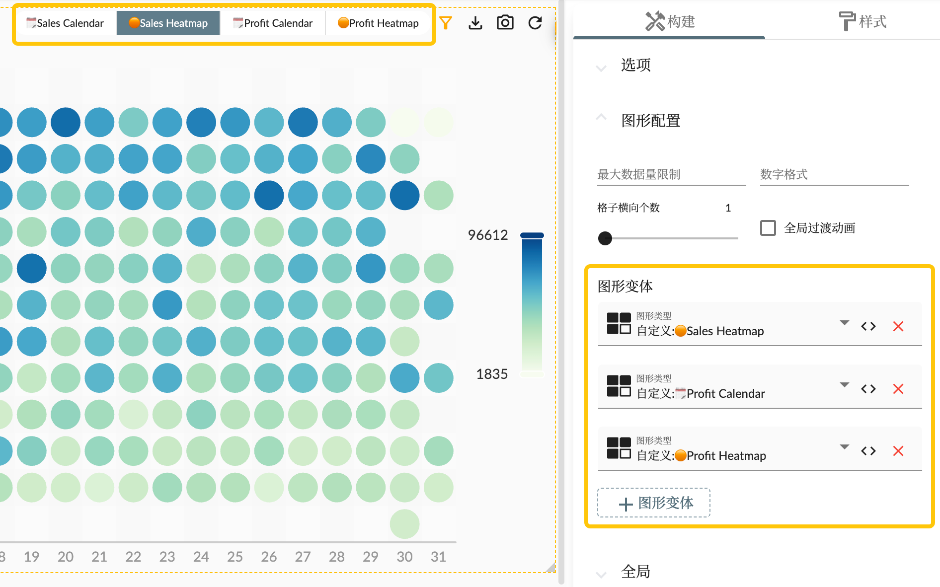
Chart Variants
The chart variants of chart widgets allow a chart widget to be displayed in different ways with the same data, so that users can choose the chart types they want to see according to their needs.
Summary
This article introduces the custom graph logic function of the story panel in the analysis cloud, and uses the AdventureWorks Sales data set as an example. By integrating the open source chart library ECharts, users can create and customize charts using the custom graph logic function, and flexibly display and manipulate data.