This article shows you how to create a story dashboard using the semantic model and indicators created earlier. The 📖Story Dashboard feature in Xpert Analytics Cloud is a visual reporting tool that helps users turn data into meaningful narratives. It is usually composed of a series of pages or slides, each of which can contain different charts, images, and text.
Final effect preview sales summary:
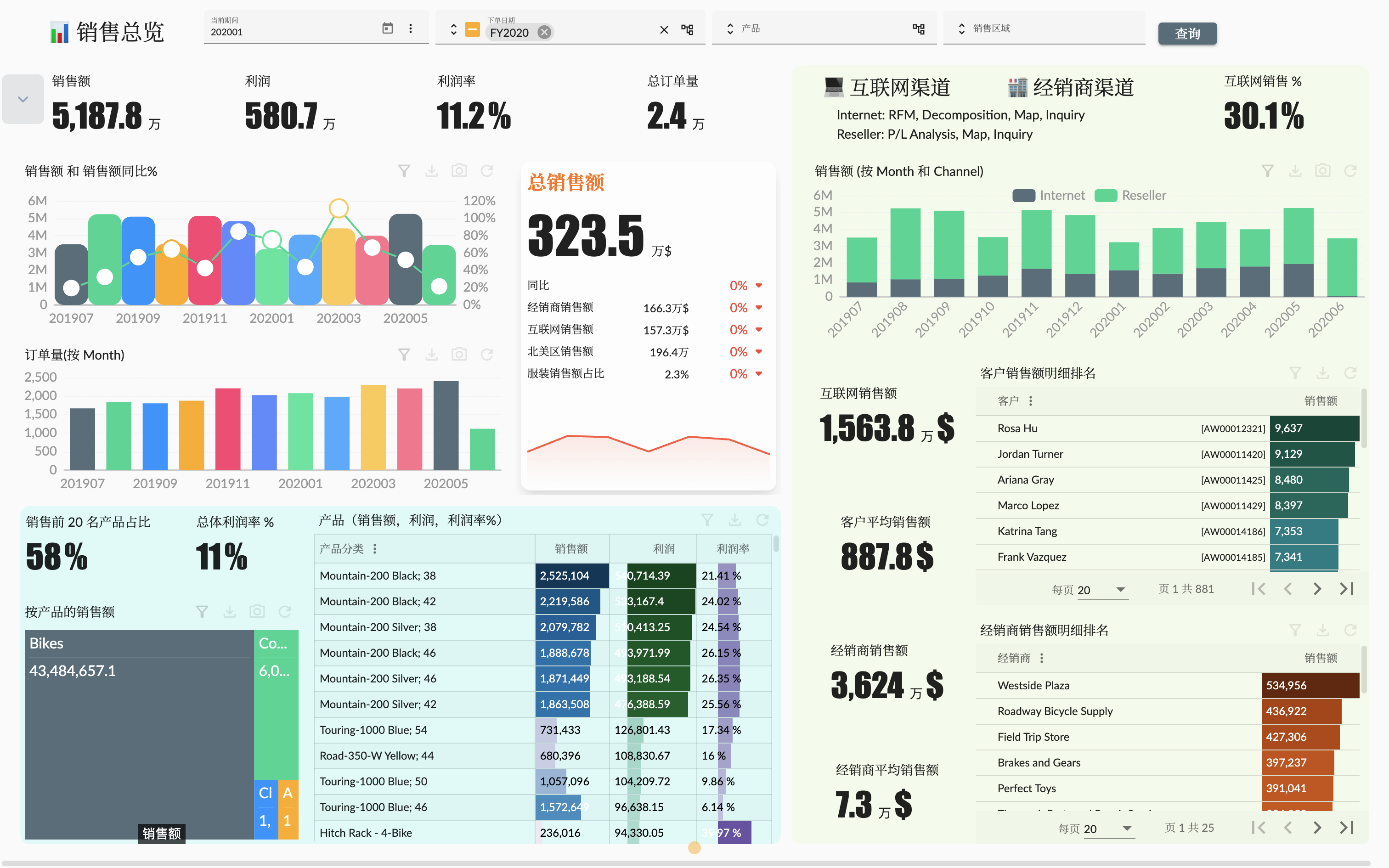
The previous few articles Sample: AdventureWorks Sales - 1. Modeling created the AdventureWorks Sales multidimensional dataset, which contains dimensions:
- Reseller;
- Customer;
- Sales Territory;
- Date;
- Product;
- Sales Order;
and measures:
- Sales Quantity;
- Sales Amount;
- Total Product Cost;
- Unit Price;
- Profit;
We created a semantic model in Sample: AdventureWorks Sales - 1. Modeling, and created multiple roles to control the access to the semantic model in Sample: AdventureWorks Sales - 2. Roles & Access Control. We also created a complete indicator system, which includes sales, resellers, customers and products in Sample: AdventureWorks Sales - 3. Indicators Management.
With the guidance of this article, readers will be able to create valuable and personalized story dashboards that better understand and present data using the semantic model dimensions, measures, and indicators previously created.
Create Project
A 🧰Project in Xpert Analytics Cloud is a collection of models, dashboards and indicators used to manage a business intelligence solution. These projects are usually used by teams or departments and are designed to provide a central location for team members to collaborate on the development, management and sharing of business intelligence solutions.
Before making a story dashboard, we need to create a project to serve as a platform for the story dashboard. In Xpert Analytics Cloud, we can create a project by following these steps:
- Click the
Projectmenu in the Xpert Analytics Cloud navigation bar to enter the project management page; - Click the
New Projectmenu button in the navigation bar of the website to open the new project dialog; - Enter the project name, for example,
Demo - AdventureWorks Sales, and description; - Select the semantic models to be used in the project, only the semantic model associated with it can be used in the story dashboard and indicators;
- Click the
Applybutton to complete the creation of the project.
After the new project is created, it will be transferred to the new project page, or manually select the newly created project. Next, you can create a story dashboard in this project.
In the Example: AdventureWorks Sales - 3. Indicator Management article, indicator management should also be done in the same project.
Story Dashboard
Name the story dashbaord: Demo - AdventureWorks Sales Dashboard
Story Design
The AdventureWorks Sales story dashboard is designed to provide comprehensive analysis of sales data to help you understand sales performance, product trends, and performance of different sales channels. With visual charts, table and indicators, you can discover key business insights and track sales target implementation.
The main part:
Sales Summary:
- Overall sales trend: shows the time trend of indicators such as sales, sales volume and profit, including the monthly or quarterly change chart of overall sales.
- Sales distribution in different channels: shows the proportion of sales in different channels in the form of indicators and tables.
Product Analysis:
- Best-selling product ranking: shows the top-selling products in terms of sales or sales volume, helping you understand the most popular products and their contribution.
- Product Category Sales Comparison: shows the proportion of sales of different product categories in the form of pie charts or stacked bar charts to help you discover the distribution of sales.
Internet Sales (B2C Customers) Analysis:
- Customer distribution: shows the geographical distribution of Internet sales customers in the form of maps or heat maps to help you understand the core market.
- Customer purchase behavior: shows the purchase frequency, unit price and purchase channel preferences of Internet sales customers, so that you can optimize marketing strategies.
Distributor Sales (B2B Customers) Analysis:
- Distributor performance: shows the sales, order volume and profit of different distributors in the form of bar charts or radar charts to help you evaluate the performance of partners.
- Distributor distribution in different regions: shows the geographical distribution of distributors in the form of maps or stacked bar charts.
Create a Story
Please refer to the official documentation Create a story for how to create a story dashboard.
The story page will adopt a fixed layout and grid compact type.
Sales Summary Page
The sales summary page can provide a comprehensive sales data analysis. We divide the sales summary page into three analysis areas and a filter bar:
Filter bar: At the top or side of the page, design a filter bar that contains selectable filters so that users can filter data as needed. Possible filters include:
- Time range: Allows users to select a specific time period, such as monthly, quarterly, or annual.
- Product: Allows users to select a specific product category or product to analyze the sales of a specific product.
- Sales territory: Allows users to select a specific geographic area or country to understand the sales performance of different regions.
Sales indicators: In the central position of the sales summary page, display the following core sales indicators in the form of charts or digital indicators:
- Total sales: Show the trend of sales in the form of a line chart or area chart, and mark the specific sales amount at each time point.
- Profit: Display the profit and profit margin indicators.
- Order volume: Show the trend of the number of orders in the form of a bar chart, and mark the specific number of orders at each time point.
- Number of customers: Display the number of customers in the form of digital indicators.
- Sales and sales growth by month of the financial calendar.
- Monthly trend of order volume by financial calendar.
Product-related overview analysis: At the bottom left of the sales overview page, provide product-related overview analysis, including:
- Proportion of best-selling products: The proportion of sales of the top 20 products ranked by sales to total sales is displayed in the form of indicators.
- Overall profit margin: All products are displayed in the form of indicators.
- Product sales ratio: Show the sales ratio of different products in a matrix tree map.
- Product sales, profit, profit margin ranking details table.
Sales channel overview analysis: On the right side of the sales overview page, provide an overview of sales channels, including:
- Proportion of Internet channel sales: The proportion of Internet sales channel sales.
- Channel sales trend: The sales of Internet and dealers sales channels are displayed in the form of a stacked bar chart.
- Internet channel sales
- Internet sales
- Customer average customer unit price
- Customer consumption ranking details table
- Reseller channel sales
- Dealer sales
- Average dealer sales
- Dealer sales ranking details table
Actual web preview:
The detailed creation process of the story dashboard is not repeated here. Users who need to understand can refer to the official documentation Story Dashboard.
Next, let's introduce some of the technical points involved in the creation process.
Year on Year Calculated Measure
In Xpert Analytics Cloud, we call the calculation of the difference between members, such as year-on-year and month-on-month, as 🧮Difference Calculated Measure. The difference calculation metric is a special calculation metric. The calculation formula contains two members, one is the current member and the other is the comparison member. There are multiple ways to compare these two members. In Meta Analysis Cloud, we can create a difference calculation metric to achieve year-on-year and month-on-month calculations.
As shown in the figure below, add a metric to the story component and click Create Calculation in the optional list panel to open the calculation member editing window, and select the type as Difference calculation metric:
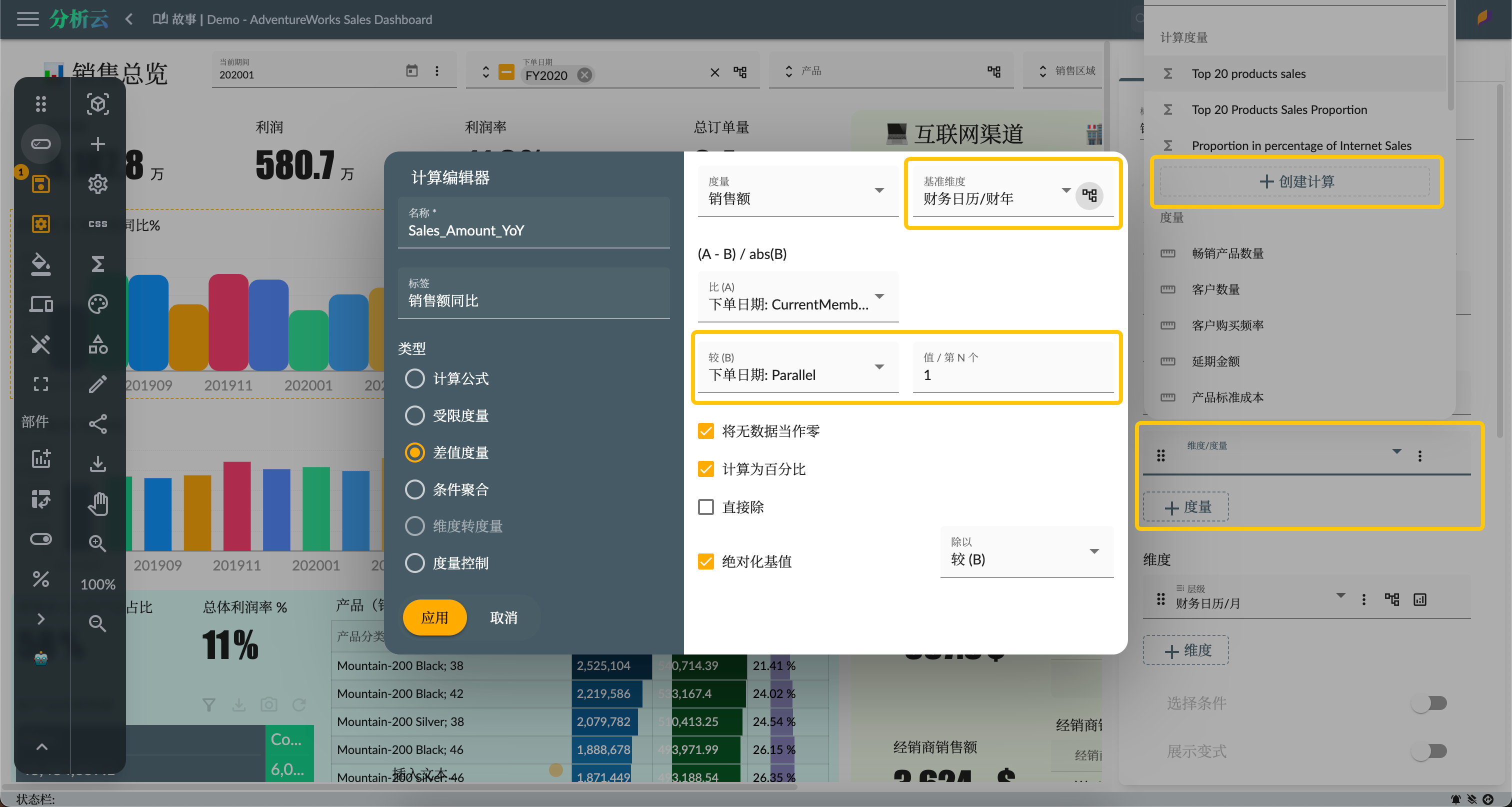
Settings to pay attention to:
- Base dimension: Select the dimension used for comparison. Here we select the Order Date dimension, and select the Fiscal Calendar hierarchy and Fiscal Year level.
- Compared to (A): Set to Current Member, which refers to the current member of the base dimension in the context.
- Compared to (B): Set to Parallel Member, 1 refers to the corresponding member in the previous fiscal year of the current member of the base dimension.
For detailed configuration, please refer to the official documentation 🧮Difference Calculated Measure
Top Count Calculated Measure
To calculate the total sales value of the top products, you can use the Conditional Aggregation in the calculation member. As shown in the following figure, select the type as Conditional Aggregation in the calculation editor, and set the operation type as TopCount, the aggregation quantity as 20, and the aggregation dimension level as Product Category/Product (because the TopCount function needs to be ranked on the member set of the product level).
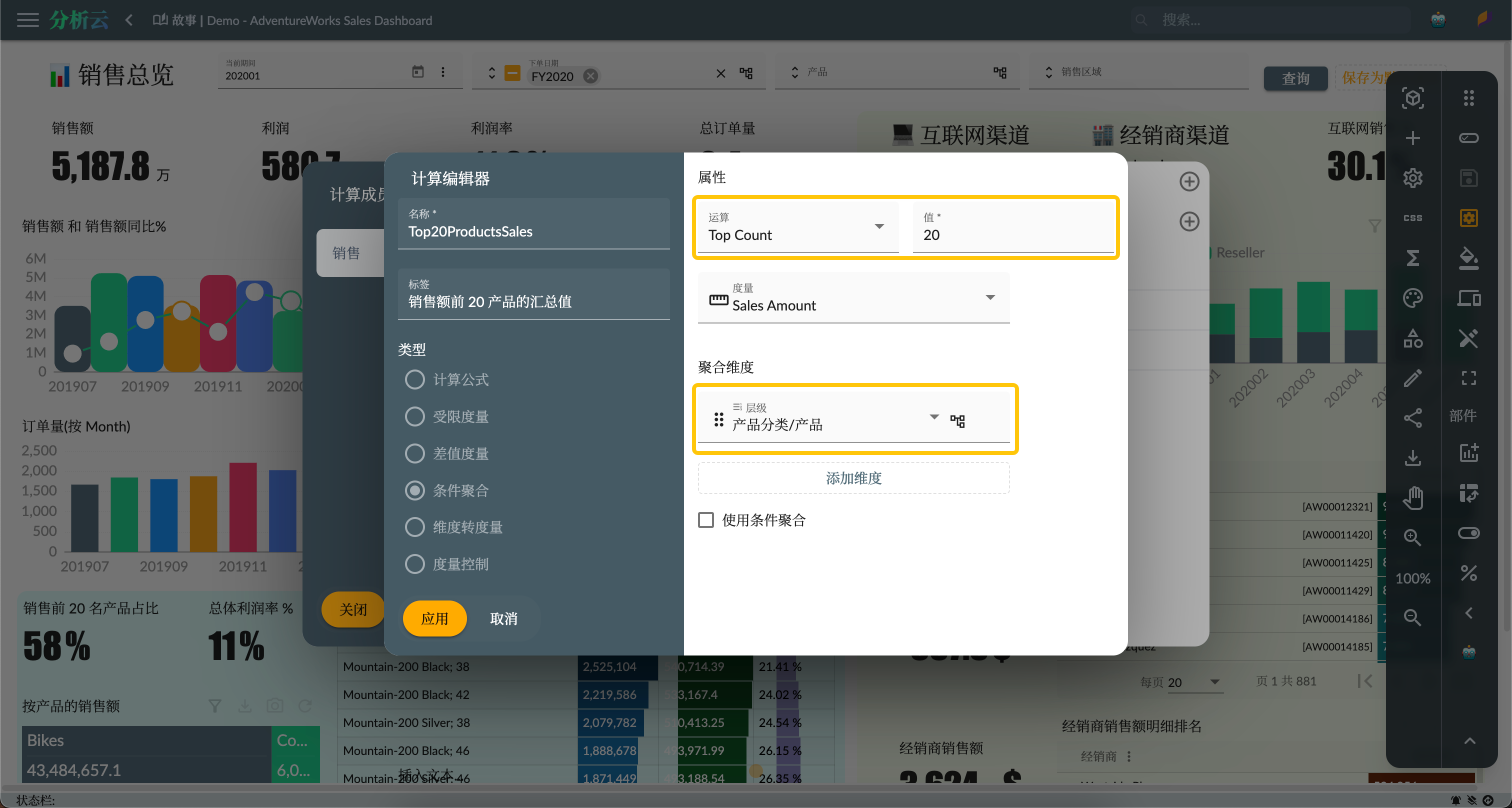
Then create another calculation and select the Formula type in the calculation editor, and divide the Top 20 Products calculation measure and the sales amount measure to get the percentage, as shown in the following figure:
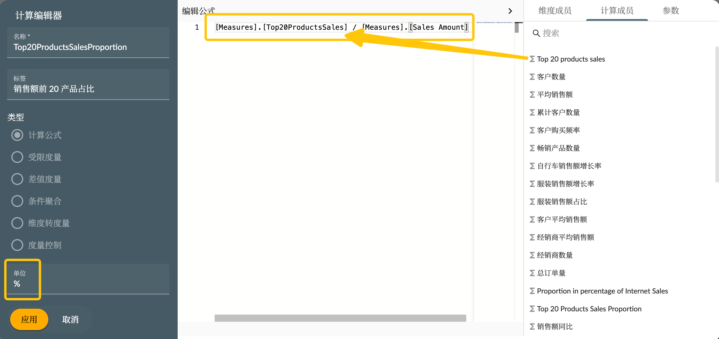
Because this formula is used to calculate the percentage, so you need to set its format as a percentage symbol %.
Use Indicators
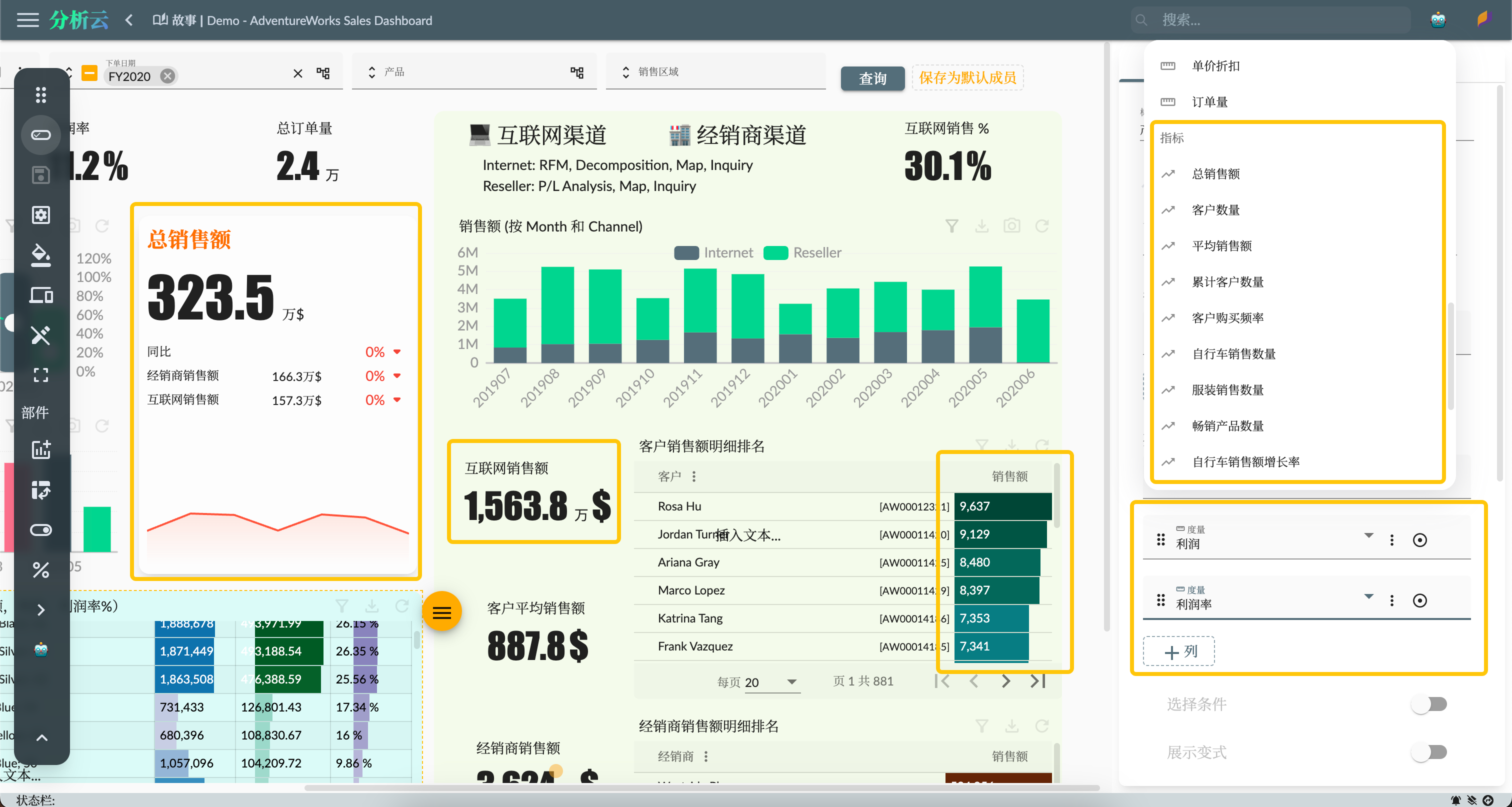
We have created a complete set of indicators system covering sales, dealers, customers and products in the article Sample: AdventureWorks Sales - 3. Indicator Management. These indicators can be used directly in the Story dashboard, such as the measures of the chart, the column fields of the table, any place where the measures are used. There are also some components designed specifically for indicators, such as indicator cards, indicator tables, etc.
As shown in the figure below, you can use specific indicator components, or use indicators on the metric properties of ordinary components:
Summary
This article mainly introduces how to use the story dashboard to analyze the overall performance data of sales summary. We will introduce more index data analysis and the rich functions of the story dashboard in subsequent articles.