
Welcome back to the AdventureWorks Sales Story series! In this article, we will continue to explore the advanced features of the Story Dashboard, focusing on dynamic parameters and linked analysis between widgets. These features will allow you to dig deeper into the data, discover hidden insights, and take your analysis to a whole new level.
In many cases, we need to focus on the top N products by sales to focus on the most valuable products. With the parameter feature of Xpert analytics cloud, you can easily implement dynamic Pareto analysis.
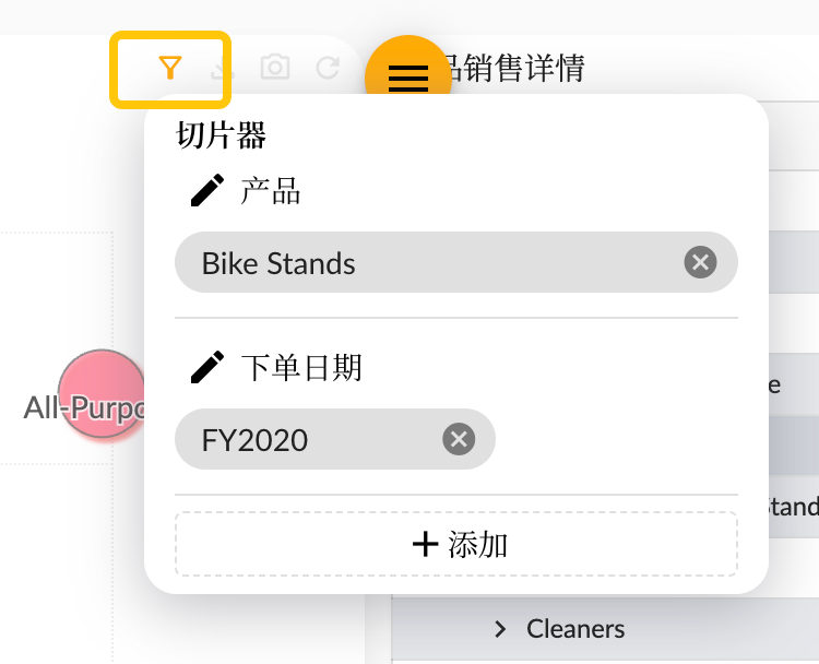
You can associate the filter conditions of different widgets through the Xpert analytics cloud's linked slicers function.
The actual effect of the story dashboard:
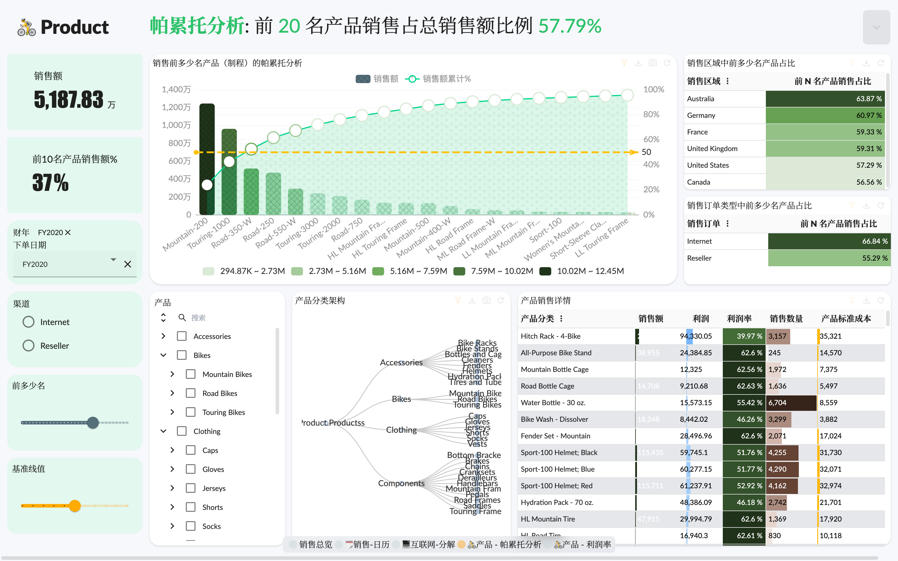
Pareto Analysis
Pareto Chart Also known as arrangement graph, primary and secondary factor analysis method, is a combination of bar chart and line chart, which is often used in quality management.
Pareto was based on the principle of "key minority and secondary majority". Its structure is two ordinate and one abscissa, which combines the bar chart and the broken line chart. The left ordinate represents the frequency, the right ordinate represents the cumulative frequency (in percentage), and the abscissa represents the names of various factors affecting the quality of influence, arranged in order of influence. The height of the rectangle represents the degree of influence of the corresponding factor (ie the frequency of occurrence), and the broken line above represents the cumulative frequency line (also known as Pareto curve). These charts are based on the "80/20" rule. That is: about 80% of the problems are caused by 20% of the causes. The "80/20" rule is also called "the critical minority and the trivial majority". In other words, you can focus on the critical root causes that cause the problem to occur and ignore the trivial majority of causes.
In our analysis of the AdventureWorks Sales model data, it is important to know which products contribute the most to sales. By using the Pareto diagram, we can better identify the top products with significant sales to guide strategic decisions. To calculate the Pareto analysis, the following factors need to be provided:
- Influence factor (abscissa) Using Product
Productdimension - Degree of influence (height of rectangle) Using Sales Amount
Sales Amountmeasurement - Cumulative degree of influence (broken line) Using cumulative sales divided by total sales
Sum(Sales Amount) - Benchmark (marked line) Use dynamic parameter
ParetoBenchmark, the default value is80
Next, let's see how to implement the Pareto chart of the above factors in the story dashboard.
Chart Config
First we create a chart widget, select the custom chart type (because we will use custom logic script to calculate cumulative sales ratio), and configure three measure fields and one dimension product.
- Sales
- Total sales of all products, used to calculate the cumulative sales ratio
- Benchmark, used to draw the mark line
- Product dimension, using the Model level under the Product Category hierarchy of the product dimension
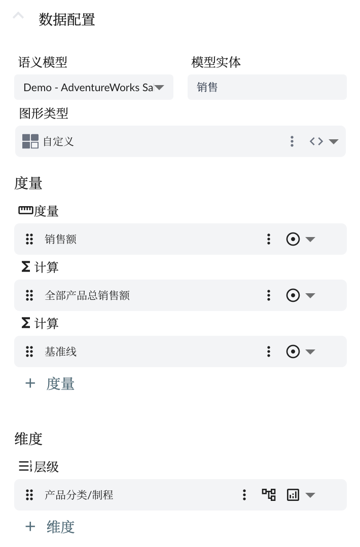
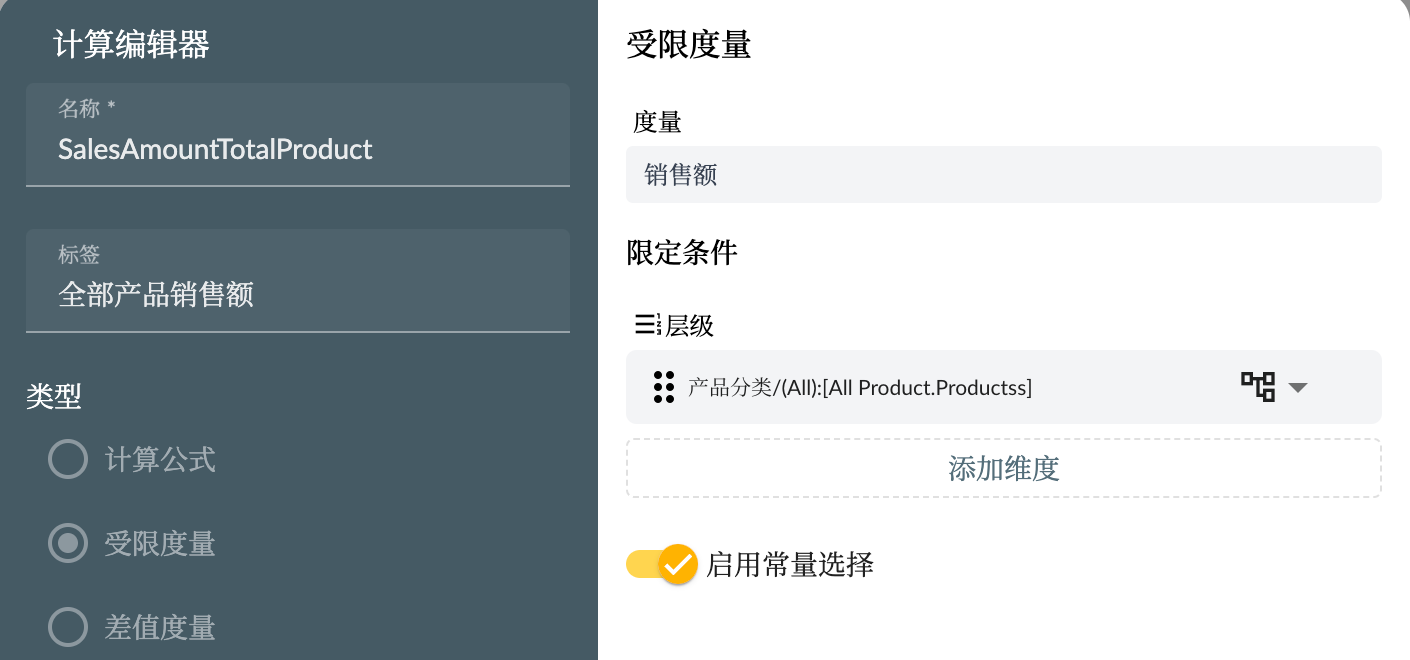
The total sales of all products use the Restricted Measure type of calculated measure, using the All member of the product category to limit the sales measure, The configuration is shown in the following figure
Parameter Config
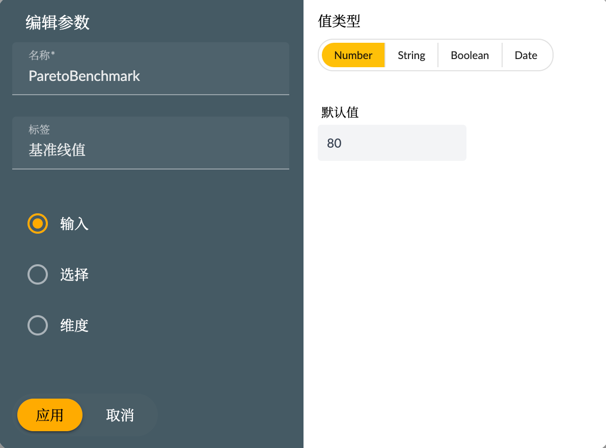
For benchmarks that need to be dynamically set, we need to create a calculated formula type calculation measure and use a numeric parameter as the calculation expression. As shown in the figure below
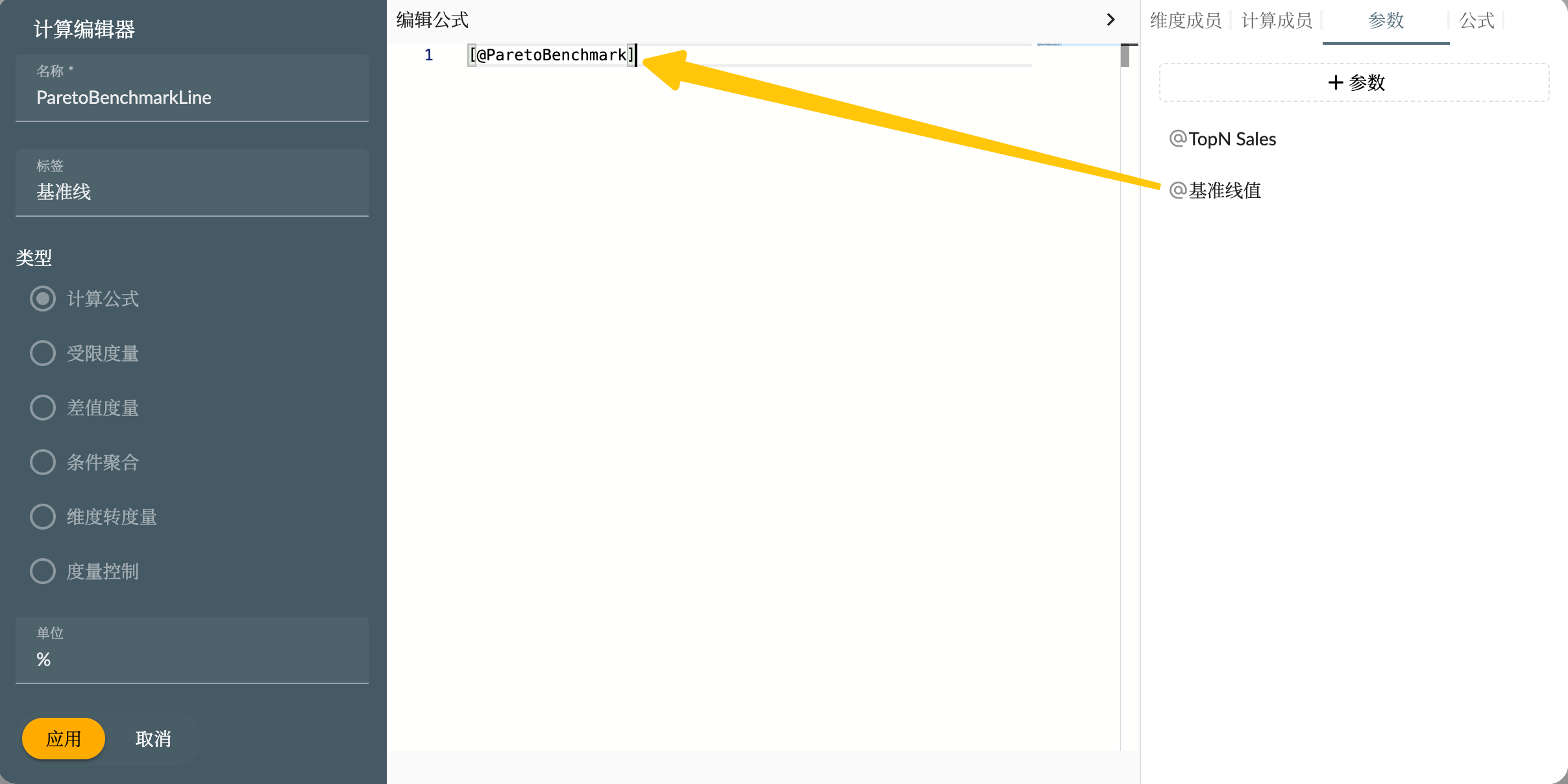
Click the create button in the parameter to create a baseline parameter to set the baseline value. Here we set the default value to 80.
Then drag the parameters into the calculation editor to use, so that when using this calculation measure, the constant value of this parameter will be obtained directly.
Top N Products
To calculate the top N products across all products, you need to use the Advanced Slicer feature in the widget slicer. Add the advanced slicer to the widget slicer.
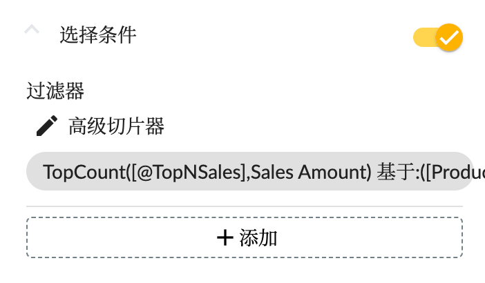
The advanced slicer configuration is as follows, in which the context condition should select the product category hierarchy consistent with the chart dimension.
The operator uses Top N which is the TopCount function, and sets the value of N to the parameter TopNSales (created in the same way as the above parameters), so that you can dynamically set the product to the top few.
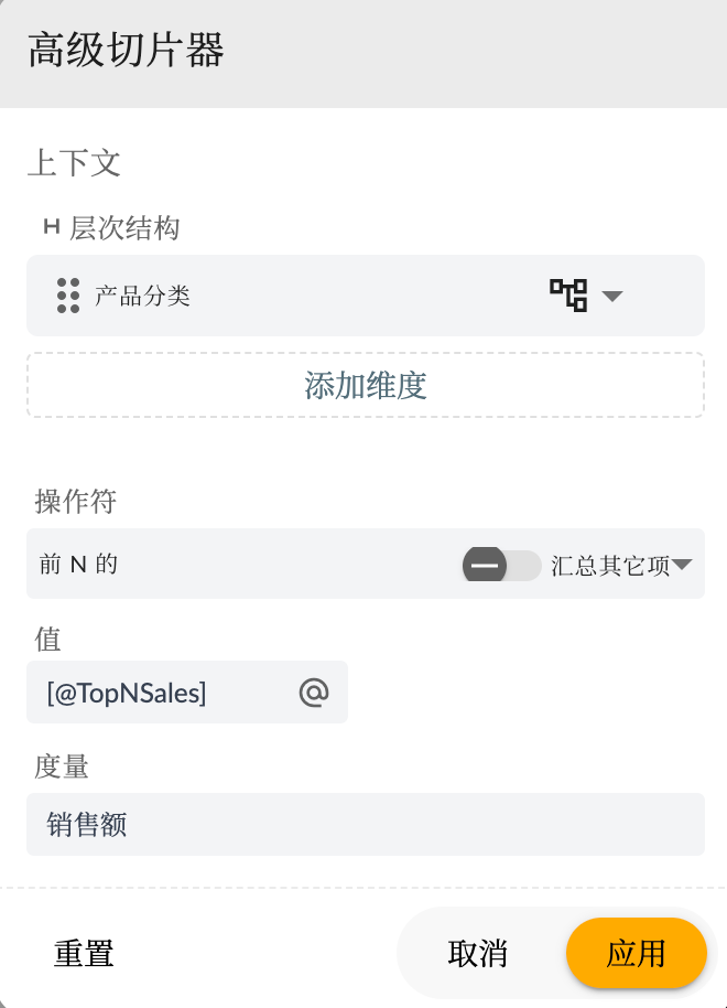
Here Aggregate other items refers to whether to aggregate other data items outside Top N into an Other item. If you turn it on, you need to pay attention to it when processing data later.
Parameter Input Control
Every time the new parameter story will automatically create the corresponding parameter input controll widget to bind this parameter for input control. For our type of numbric parameters, you can use numbric input controllers or sliders, as shown below
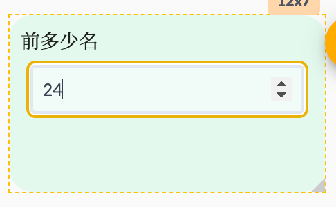
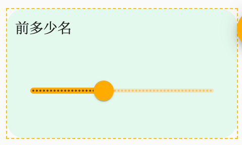
Users can also manually create input control and select the controller's field for the corresponding parameter. Note that multiple input controllers cannot be created for the same parameter in the same story dashboard.
Custom Logic Script
For cumulative value percentage calculations and chart rendering, we use custom logic scripts, as follows
// queryResult: QueryReturn<any>, chartAnnotation: ChartAnnotation, entityType: EntityType, locale: string, chartsInstance: ECharts
const measure = chartAnnotation.measures?.[0];
const pareto = chartAnnotation.measures?.[1];
const benchmark = chartAnnotation.measures?.[2];
const dimension = chartAnnotation.dimensions?.[0];
const {
  echarts,
  getEntityHierarchy,
  getPropertyCaption,
  assignDeepOmitBlank,
  formatting,
} = utils;

if (!dimension || !measure) {
  return {};
}

// 获取维度的层次结构字段信息
const hierarchy = getEntityHierarchy(entityType, dimension);
// 获取维度成员的显示名称字段名
const caption = getPropertyCaption(hierarchy);

const source = [...queryResult.data];
source.sort((a, b) => b[measure.measure] - a[measure.measure]);
// 计算度量值范围
const min = source[source.length - 1][measure.measure];
const max = source[0][measure.measure];
const options = {
  dataset: [
    {
      source: source.map((item, index) => ({
        ...item,
        pareto:
          (source
            .slice(0, index + 1)
            .reduce((acc, item) => acc + item[measure.measure], 0) /
            item[pareto.measure]) *
          100,
      })),
    },
  ],
  visualMap: {
    min,
    max,
    calculable: true,
    type: "piecewise",
    orient: "horizontal",
    left: "center",
    bottom: "10",
    precision: 1,
    dimension: measure.measure,
    // Measure palette colors as visualMap color
    inRange: measure.palette?.colors
      ? {
          color: measure.palette?.colors,
        }
      : null,
    formatter: (low, high) => {
    return formatting(low, measure.formatting) + ' ~ ' + formatting(high, measure.formatting)
}
  },
  grid: [
    {
      containLabel: true,
      bottom: 30,
    },
  ],
  series: [
    assignDeepOmitBlank(
      {
        id: measure.measure,
        name: "销售额",
        type: "bar",
        measure: measure.measure,
        datasetIndex: 0,
        selectedMode: "single",
        yAxisIndex: 0,
        encode: {
          x: caption,
          y: measure.measure,
          tooltip: [],
        },
        tooltip: {},
        xAxisIndex: 0,
      },
      measure.chartOptions?.seriesStyle,
      5
    ),
    {
      id: "pareto",
      name: "销售额累计%",
      type: "line",
      measure: "pareto",
      datasetIndex: 0,
      selectedMode: "single",
      yAxisIndex: 1,
      encode: {
        x: caption,
        y: "pareto",
        tooltip: [],
      },
      tooltip: {},
      xAxisIndex: 0,
      markLine: {
        data: [
          {
            yAxis: source[0][benchmark.measure],
            name: "Benchmark",
            lineStyle: benchmark.chartOptions?.seriesStyle?.lineStyle,
          },
        ],
      },

      ...(pareto.chartOptions?.seriesStyle ?? {}),
    },
  ],

  tooltip: [
    {
      trigger: "axis",
      valueFormatter: (value) => {
        return formatting(value, measure.formatting, locale);
      },
    },
  ],
  legend: [{ show: true }],
  dataZoom: [],
  xAxis: [
    assignDeepOmitBlank({
      type: "category",
      axisPointer: {
        label: {},
      },
      axisLabel: {
        formatter: (value, index) => {
          return source[index][caption];
        },
      },
      orient: "xAxis",
      gridIndex: 0,
    }, dimension.chartOptions?.axis, 5),
  ],
  yAxis: [
    {
      type: "value",
      axisLabel: {},
      gridIndex: 0,
      axisLabel: {
        formatter: (value) => {
          return formatting(value, measure.formatting, locale);
        },
      },
    },
    {
      type: "value",
      axisLabel: {},
      gridIndex: 0,
      axisLabel: {
        formatter: "{value}%",
      },
    },
  ],
};

return {
  options,
};
For more information on custom chart logic, see the previous post Sample: AdventureWorks Sales - 5. Story Custom Graphics.
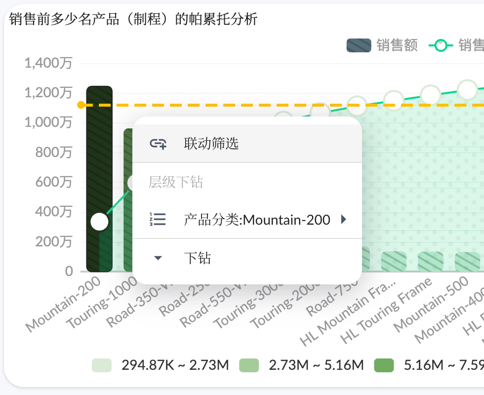
Pareto analysis chart widget final effect:
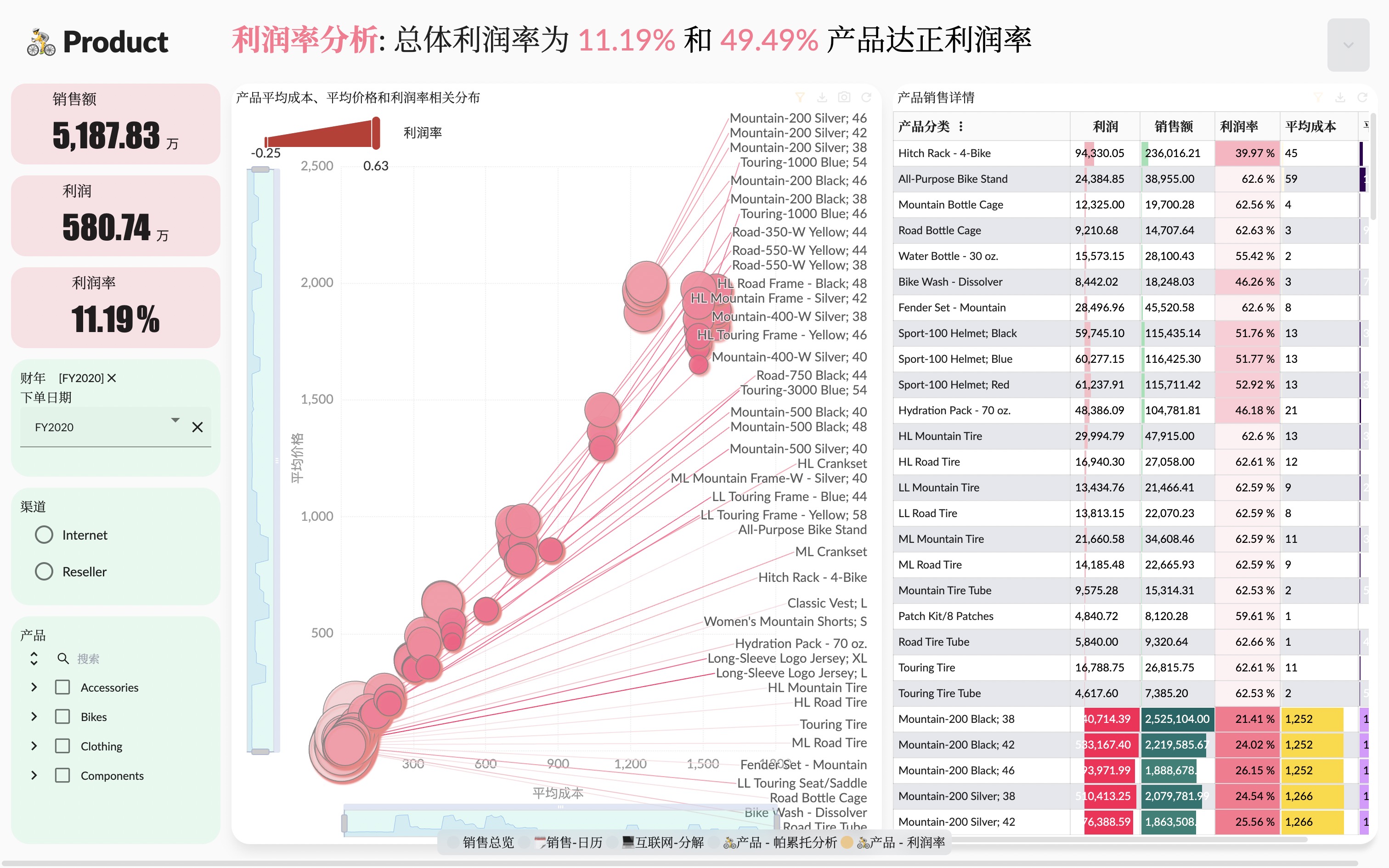
Use Parameter Measure and Indicator in Text Widgets
Next, we will use parameters, measures and indicators in text widgets and component title text to present the calculation results of data in a more vivid way. As shown in the figure below, parameters and measures are used in text components, and the parameter format is [@name] measures (same as indicators) format is [#name]

Users can manually insert parameters and metrics, or drag and drop in the parameter and metric list on the right. The calculation results of parameters and metrics will be displayed in preview or view mode.
In addition to the text component and the rich text component, the title text content of the graphics component, the table component, and the key indicator component can also use parameters and metrics, and the usage is the same as that of the text component.
Linked Analysis
Linked Analysis is a linked analysis feature in a single page of the story dashboard, in which widgets interact with each other through slicers to filter each other. In addition to the usual filter bar and input control widgets that can achieve linked analysis of other components, linked analysis can also be performed between components.
For chart widgets, the user clicks the data point of the graphic to pop up the context menu: linked analysis, hierarchical drilling, and drilling. After the user selects the linked analysis, the slicer corresponding to this data point will be used to filter other components.
You can also set the "Real-time Linked Analysis" and "Disable Context Menu" in the options of the chart card component to achieve real-time linked analysis without the need to pop up the menu but to click on the chart.
For the table component, after selecting a cell, the dimension member corresponding to the cell will be used to link and filter other components. If the cell is a measure value, then all dimension members corresponding to the current row will be used to link and filter other components.
Users can find the slicer button in the toolbar of the chart and table widgets, and open the slicer panel. All slicers that affect the current widget can be seen. Users can also add more slicers temporarily, but the slicers added here are not saved.
Summary
In summary, Xpert analytics cloud's dynamic parameters and linked analysis slicers features provide you with a more flexible and in-depth way to explore data. You can quickly generate insights, show results, and make meaningful linkage analysis between different widgets based on different parameters and selections. The story dashboard will become a powerful tool for your data-driven decision-making, helping you better understand the business situation and formulate effective strategies.
Thank you for continuing to follow our "Xpert Analytics Cloud" story series of articles! Stay tuned for the next article, where we'll continue to share more practical tips about advanced features. If you have any questions or suggestions, please feel free to contact us.